
Typography Wedding Invitations
Explore our typography wedding invitations below — designs where beautiful lettering is the hero, from bold modern type to flowing calligraphy and monograms. Each design is part of a complete matching suite, from save the dates to on-the-day menus, signage and thank you cards.
Typography (Forest Green) Wedding Invitations
Bold, type-led design, the signature. View the complete Typography (Forest Green) wedding stationery collection →

⭐️⭐️⭐️⭐️⭐️
Read what 1000s of happy couples say about us →
Modern and effortlessly stylish, our Typography Collection wedding invitation in forest green features bold type and a minimal layout for a clean, contemporary look. Ideal for couples planning a chic city celebration or a nature-inspired wedding with a modern twist, this design brings simplicity and impact together beautifully. Designed and handled personally by Harry & Ami – every order is managed with care until you’re fully happy.
What’s Included?
– Wedding Invitations in your chosen design, printed on 300gsm off-white tactile paper.
– Plain white envelopes are included free of charge. Prefer colour envelopes? Browse colour envelope options.
– Full design service included. We create your design for you and send digital proofs, with revisions until you’re happy.
– Free standard UK delivery for a limited time.
How to Order
– Simply select the quantity of Wedding Invitations you need and complete your purchase. You’re in safe hands.
– Once your order is placed, we’ll personally email you within 1 business day to request your wording (we’ll also include a helpful example of how to send it). If you already have it ready, feel free to add it at checkout in the personalisation box.
– We’ll take care of the full design for you and send a digital proof (PDF) within one business day. Need any changes? No problem at all – we’re happy to tweak it until you’re completely happy. Nothing is printed until you give us the final go-ahead.
– It’s just the two of us here – myself (Harry) and my wife (Ami) – and we personally handle every order with care. We’re here to make it easy and stress-free for you.
Please note: If you need separate Day and Evening Wedding Invitations (with different wording), please add them to your basket as separate items. For example, add 20 Day and 30 Evening cards individually, rather than one combined quantity of 50.
What Can I Customise?
– All wording can be changed to suit your wedding details.
– Need more space for wording? A small amount of additional wording can be printed on the reverse of the invitation, included in the price. This space is designed for a short overflow note, such as a brief RSVP line or a small message about gifts. As part of the invitation design, we include a centred text box that fits up to 150 characters (approximately two short sentences). This layout is fixed so the wording remains balanced with the design. If you need to include more detailed guest information (accommodation, travel, timings etc.), we recommend adding one of our matching information cards, which can be ordered by clicking here.
– QR codes can be added (please note: we can’t change the colour of the QR code and can only use the file you provide).
– Colour changes may be possible on some designs. Generally, text-only designs can be colour-edited, while illustrated ones cannot, but feel free to message us to check.
Guest Name Printing
Normally, your invitation might read something like "Sarah and James invite you to the ceremony and celebration of their marriage", but with guest name printing, we replace that with your guest's actual name, so it reads "Sarah and James invite Emily and Tom to the ceremony and celebration of their marriage" instead — personalised for exactly who's being invited. If more than one person is invited on the same card (a couple, a family, or a group of friends) we can include all of their names together, and this still counts as just one guest name for pricing, however many you list — we'll always make sure everything fits neatly on a single line, so it looks beautiful every time.
Want some invitations with names and some without? For example, if you've ordered 50 invitations but only have 45 names ready, simply select guest name printing from the dropdown as normal — we'll use your full list, and any spares will be left with a gap for you to handwrite a name yourself. Handy for any last-minute additions to your guest list.
Add Matching RSVP Cards
An RSVP card is how your guests let you know whether they can attend (“RSVP" simply means "please reply.”) Your guests fill in the card to confirm they're coming (and often note things like dietary requirements), then post it back to you using the free envelope provided, so you know your final numbers in good time for your venue and caterer.
Complete your suite with RSVP cards printed in the same design as your invitations, so your whole first impression feels considered and coordinated. Each is an A7 card supplied with a free envelope, ready for your guests to reply by post.
Dimensions
– A6 size (105mm x 148mm).
– Prefer a larger size? You can also order this design in A5, click here for pricing and details.
Paper Type & Sustainability
Your Wedding Invitations are digitally printed on 300gsm luxury off-white, tactile paper. Each order includes plain white envelopes free of charge.
Please note: any silver or gold elements are printed digitally (not foil).
Wedding Invitation paper details:
– Elemental Chlorine Free
– FSC® Mix Certified
– Acid Free
– Free from Heavy Metals
– Long Life
– Contains Selected Secondary Fibres
Are Samples Available?
Yes, we offer non-personalised samples for many of our designs. Browse our wedding stationery samples to see the quality before you order.
Matching Stationery
View the full Typography Collection for matching wedding stationery in this design, or browse all Wedding Invitations to explore more styles.
Turnaround Times
– Once we receive your order, we’ll message you for your wording. After we have it, you’ll receive a digital proof within 1 business day (often same day, depending on timing).
– If your order includes a bespoke venue illustration, please allow up to 2 additional days for your proof.
– Need changes? Each round of amends takes 1 business day. On average, allow around a week for the full design process, depending on how quickly we receive your feedback.
– Once you approve your design, printing usually takes 1–2 business days, and delivery 1–3 business days. We recommend allowing up to 2 weeks total to cover any unexpected courier delays.
– Need it sooner? We offer faster tracked delivery, please get in touch for pricing and availability.
Important Details
– If you have any concerns at all, please don’t hesitate to reach out – we genuinely want you to love your stationery. In the rare event of courier damage or a lost parcel, we’ll always ensure your items are reprinted and resent, so you can feel confident you’ll receive exactly what you’ve paid for.
– Full refunds cannot be offered once a digital file or physical item has been sent, as every item is personalised.
– Colours may appear different in print than on screen because printing and digital displays use different colour processes and values.
– Colours may vary between samples, orders, and batches – similar to wallpaper printing, which requires single-batch orders for consistency.
– All images, designs, and product descriptions on our website are protected by copyright. They may not be edited, copied, recreated, or used for personal or commercial purposes without permission. This includes reproducing wording or designs.
– Sharing our products on social media is allowed only if you tag us clearly. We monitor for infringement closely. Unauthorised copying or use of our designs or descriptions will be met with legal action. H&A.
⭐️⭐️⭐️⭐️⭐️
Read what 1000s of happy couples say about us →
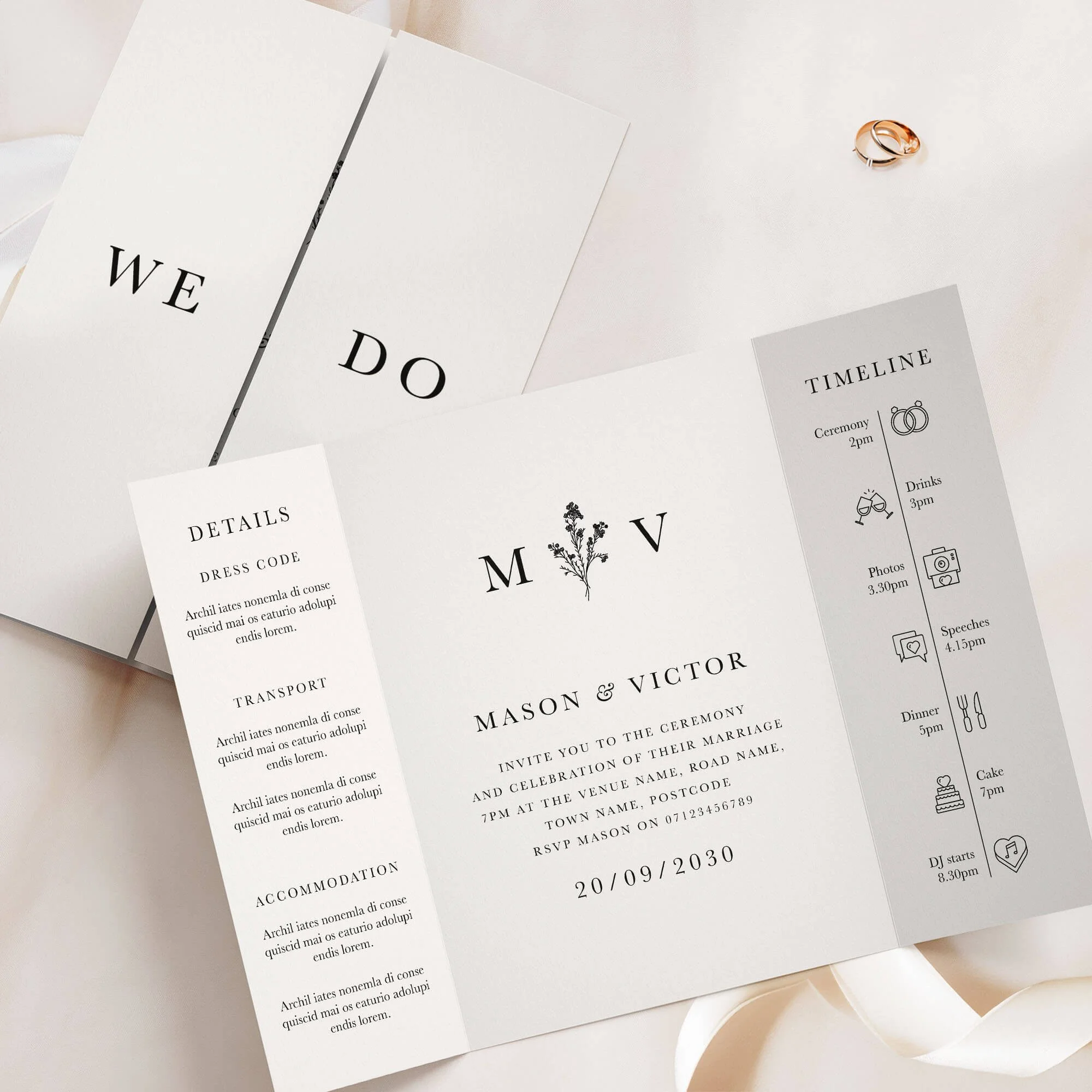
The Typography Collection gatefold invitation features a bold and contemporary design with striking forest green text running vertically up the centre panel. Clean lines and a strong layout make this design ideal for modern weddings, minimalist themes, or couples looking for a confident and unconventional approach to their stationery. A stylish statement for those who love simplicity with edge. Designed and handled personally by Harry & Ami – every order is managed with care until you’re fully happy.
What’s Included?
– Gatefold Wedding Invitations in your chosen design, printed on 300gsm off-white tactile paper.
– Plain white envelopes are included free of charge. Prefer colour envelopes? Browse colour envelope options.
– Full design service included. We create your design for you and send digital proofs, with revisions until you’re happy.
– Free standard UK delivery for a limited time.
How to Order
– Simply select the quantity of Gatefold Wedding Invitations you need and complete your purchase. You’re in safe hands.
– Once your order is placed, we’ll personally email you within 1 business day to request your wording (we’ll also include a helpful example of how to send it).
– We’ll take care of the full design for you and send a digital proof (PDF) within one business day. Need any changes? No problem at all – we’re happy to tweak it until you’re completely happy. Nothing is printed until you give us the final go-ahead.
– It’s just the two of us here – myself (Harry) and my wife (Ami) – and we personally handle every order with care. We’re here to make it easy and stress-free for you.
Please note: If you need separate Day and Evening Wedding Invitations (with different wording), please add them to your basket as separate items. For example, add 20 Day and 30 Evening cards individually, rather than one combined quantity of 50.
What Can I Customise?
– Want to change the wording on the front of the gatefold (e.g., “We Do”)? No problem! You can personalise it with your names, initials, or other wording you’d prefer.
– Prefer extra wording instead of the timeline section? We can swap it out for wording more meaningful to you.
– The text on the details panel is completely customisable – feel free to change it to suit your needs and all the wording on the middle panel can be tailored to better reflect your information.
– Choose from over 50 different wedding related icons to fully personalise your Order of the Day Timeline.
– Need more space for wording? We offer text-only printing on the back at no extra cost.
– QR codes can be added (please note: we can’t change the colour of the QR code and can only use the file you provide).
– Colour changes may be possible on some designs. Generally, text-only designs can be colour-edited, while illustrated ones cannot, but feel free to message us to check.
Guest Name Printing
Normally, your invitation might read something like "Sarah and James invite you to the ceremony and celebration of their marriage", but with guest name printing, we replace that with your guest's actual name, so it reads "Sarah and James invite Emily and Tom to the ceremony and celebration of their marriage" instead — personalised for exactly who's being invited. If more than one person is invited on the same card (a couple, a family, or a group of friends) we can include all of their names together, and this still counts as just one guest name for pricing, however many you list — we'll always make sure everything fits neatly on a single line, so it looks beautiful every time.
Want some invitations with names and some without? For example, if you've ordered 50 invitations but only have 45 names ready, simply select guest name printing from the dropdown as normal — we'll use your full list, and any spares will be left with a gap for you to handwrite a name yourself. Handy for any last-minute additions to your guest list.
Add Matching RSVP Cards
An RSVP card is how your guests let you know whether they can attend (“RSVP" simply means "please reply.”) Your guests fill in the card to confirm they're coming (and often note things like dietary requirements), then post it back to you using the free envelope provided, so you know your final numbers in good time for your venue and caterer.
Complete your suite with RSVP cards printed in the same design as your invitations, so your whole first impression feels considered and coordinated. Each is an A7 card supplied with a free envelope, ready for your guests to reply by post.
Dimensions
– A6 size (105mm x 148mm) once folded, A5 size when flat (148mm x 210mm).
– Prefer a larger size? You can also order this design in A5 (once folded), click here for pricing and details.
Paper Type & Sustainability
Your Gatefold Wedding Invitations are digitally printed on 300gsm luxury off-white, tactile paper. Each order includes plain white envelopes free of charge.
Please note: any silver or gold elements are printed digitally (not foil).
Wedding Invitation paper details:
– Elemental Chlorine Free
– FSC® Mix Certified
– Acid Free
– Free from Heavy Metals
– Long Life
– Contains Selected Secondary Fibres
Are Samples Available?
Yes, we offer non-personalised samples for many of our designs. Browse our wedding stationery samples to see the quality before you order.
Matching Stationery
View the full Typography Collection for matching wedding stationery in this design, or browse all Gatefold Wedding Invitations to explore more styles.
Turnaround Times
– Once we receive your order, we’ll message you for your wording. After we have it, you’ll receive a digital proof within 1 business day (often same day, depending on timing).
– If your order includes a bespoke venue illustration, please allow up to 2 additional days for your proof.
– Need changes? Each round of amends takes 1 business day. On average, allow around a week for the full design process, depending on how quickly we receive your feedback.
– Once you approve your design, printing usually takes 1–2 business days, and delivery 1–3 business days. We recommend allowing up to 2 weeks total to cover any unexpected courier delays.
– Need it sooner? We offer faster tracked delivery, please get in touch for pricing and availability.
Important Details
– If you have any concerns at all, please don’t hesitate to reach out – we genuinely want you to love your stationery. In the rare event of courier damage or a lost parcel, we’ll always ensure your items are reprinted and resent, so you can feel confident you’ll receive exactly what you’ve paid for.
– Full refunds cannot be offered once a digital file or physical item has been sent, as every item is personalised.
– Colours may appear different in print than on screen because printing and digital displays use different colour processes and values.
– Colours may vary between samples, orders, and batches – similar to wallpaper printing, which requires single-batch orders for consistency.
– All images, designs, and product descriptions on our website are protected by copyright. They may not be edited, copied, recreated, or used for personal or commercial purposes without permission. This includes reproducing wording or designs.
– Sharing our products on social media is allowed only if you tag us clearly. We monitor for infringement closely. Unauthorised copying or use of our designs or descriptions will be met with legal action. H&A.
⭐️⭐️⭐️⭐️⭐️
Read what 1000s of happy couples say about us →
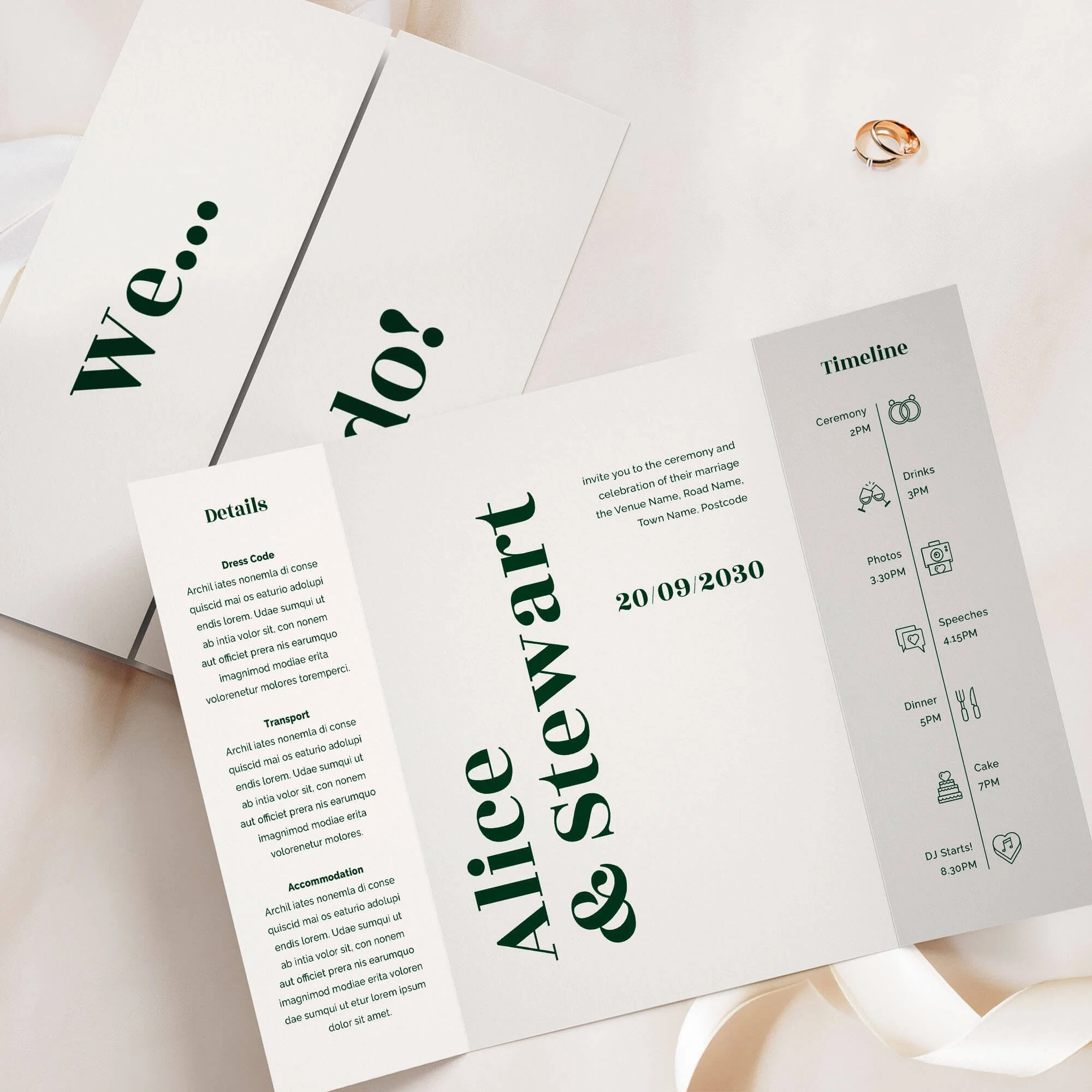
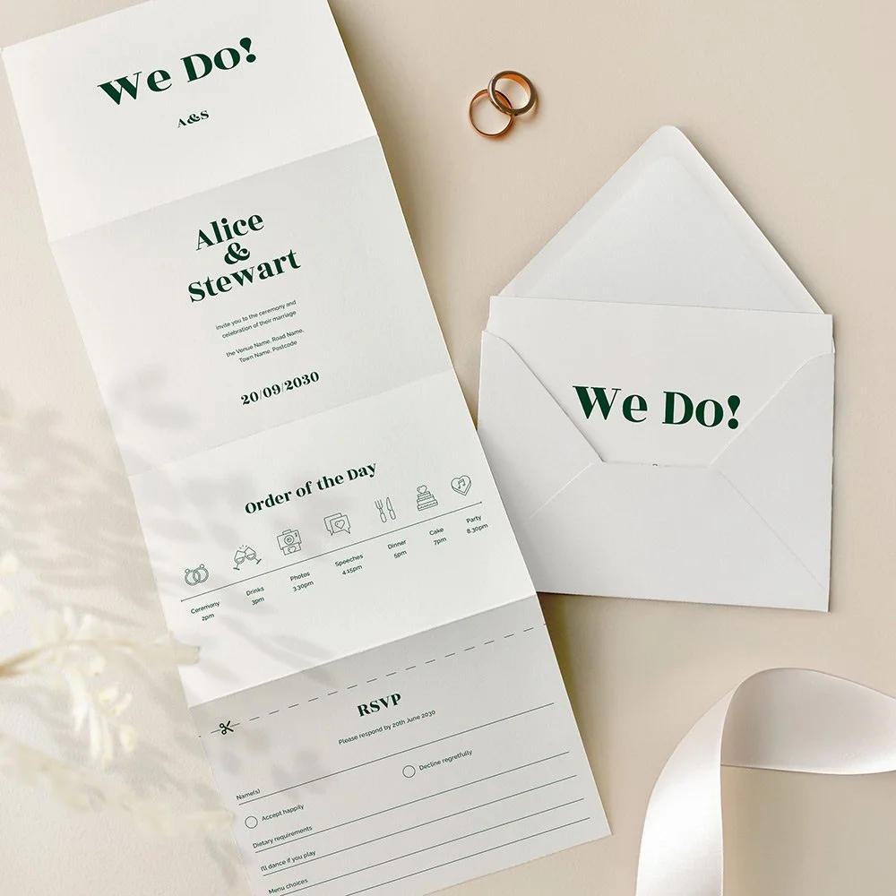
The elegant Typography Collection Forest Green concertina wedding invitation brings refined modern elegance to your stationery suite. Featuring crisp serif and sans‑serif typography in a sophisticated forest‑green palette, this fully customisable design includes a cover panel, invitation panel, order‑of‑the‑day timeline or details panels, and a perforated tear‑off RSVP postcard. Printed on luxury off‑white tactile paper, this all‑in‑one format combines form and function – ideal for couples planning a polished, contemporary wedding. Designed and handled personally by Harry & Ami – every order is managed with care until you’re fully happy.
What’s Included?
– Concertina Wedding Invitations in your chosen design, printed on 300gsm off-white tactile paper. Each invitation includes a tear-off RSVP card as part of the design. If you'd prefer guests to RSVP via QR code or email, we can replace the tear-off panel with a text-only version instead.
– C6 plain white envelopes are included free of charge. Prefer colour envelopes? Browse colour envelope options.
– Full design service included. We create your design for you and send digital proofs, with revisions until you’re happy.
– Free standard UK delivery for a limited time.
How to Order
– Simply select the quantity of Concertina Wedding Invitations you need and complete your purchase. You’re in safe hands.
– Once your order is placed, we’ll personally email you within 1 business day to request your wording (we’ll also include a helpful example of how to send it).
– We’ll take care of the full design for you and send a digital proof (PDF) within one business day. Need any changes? No problem at all – we’re happy to tweak it until you’re completely happy. Nothing is printed until you give us the final go-ahead.
– It’s just the two of us here – myself (Harry) and my wife (Ami) – and we personally handle every order with care. We’re here to make it easy and stress-free for you.
Please note: If you need separate Day and Evening Wedding Invitations (with different wording), please add them to your basket as separate items. For example, add 20 Day and 30 Evening cards individually, rather than one combined quantity of 50.
What Can I Customise?
– If you’d prefer more space for wording, we can swap the timeline panel for additional text, or even replace the RSVP panel if it’s not needed.
– If you’ve selected double-sided printing, the details panel wording is fully customisable – use any text you prefer.
– Choose from over 50 different wedding related icons to fully personalise your Order of the Day Timeline.
– All text on the main invitation panel is editable to perfectly match your wedding wording preferences.
– QR codes can be added (please note: we can’t change the colour of the QR code and can only use the file you provide).
– Colour changes may be possible on some designs. Generally, text-only designs can be colour-edited, while illustrated ones cannot, but feel free to message us to check.
Guest Name Printing
Normally, your invitation might read something like "Sarah and James invite you to the ceremony and celebration of their marriage", but with guest name printing, we replace that with your guest's actual name, so it reads "Sarah and James invite Emily and Tom to the ceremony and celebration of their marriage" instead — personalised for exactly who's being invited. If more than one person is invited on the same card (a couple, a family, or a group of friends) we can include all of their names together, and this still counts as just one guest name for pricing, however many you list — we'll always make sure everything fits neatly on a single line, so it looks beautiful every time.
Want some invitations with names and some without? For example, if you've ordered 50 invitations but only have 45 names ready, simply select guest name printing from the dropdown as normal — we'll use your full list, and any spares will be left with a gap for you to handwrite a name yourself. Handy for any last-minute additions to your guest list.
Dimensions
– A6 once folded (105mm x 148mm), 420mm x 148mm when flat.
What are the 8 panels if I select double sided?
1. Cover panel – Typically features your names or initials.
2. Invitation panel – Includes the venue name, date, time, and other key details.
3. Timeline panel – Showcases your order of the day with icons (choose from 50 available).
4. RSVP panel – For guest responses.
5. Details panel 1 – Ideal for your gift wish, wedding website, or a QR code.
6. Details panel 2 – Can include dress code, travel directions, or accommodation info.
7. Details panel 3 – Often used for a menu or dietary notes.
8. Reverse of the RSVP panel – Typically features your return address.
Prefer fewer panels or want to customise? No problem! We can leave panels blank or swap them – for example, replacing the timeline with extra wording or other content.
What are the 4 panels if I select single sided?
1. Cover panel – Typically features your names or initials.
2. Invitation panel – Includes your venue name, date, time, and key details.
3. Timeline panel – Displays your order of the day using icons (we have 50 to choose from). This can be swapped for a details panel if preferred.
4. RSVP panel – Adapted into a single-sided postcard format for the single-sided option.
Want to make changes? We can leave panels blank or customise the layout—such as removing the timeline to include additional wording or other information.
RSVP Panel
Your guests can easily tear off the RSVP panel along the perforated edge, which will already have your return address printed. If you’ve selected double-sided printing, the address will appear on the reverse; for single-sided, it will be printed on the front. The RSVP includes customisable sections for names, accept/decline options, dietary requirements, song choices, and more – tailored to suit your needs. If you would like a bespoke menu choice RSVP panel please get in touch for pricing.
Paper Type & Sustainability
Your Concertina Wedding Invitations are digitally printed on 300gsm luxury off-white, tactile paper. Each order includes plain white envelopes free of charge.
Please note: any silver or gold elements are printed digitally (not foil).
Wedding Invitation paper details:
– Elemental Chlorine Free
– FSC® Mix Certified
– Acid Free
– Free from Heavy Metals
– Long Life
– Contains Selected Secondary Fibres
Are Samples Available?
Yes, we offer non-personalised samples for many of our designs. Browse our wedding stationery samples to see the quality before you order.
Matching Stationery
View the full Typography Collection for matching wedding stationery in this design, or browse all Concertina Wedding Invitations to explore more styles.
Turnaround Times
– Once we receive your order, we’ll message you for your wording. After we have it, you’ll receive a digital proof within 1 business day (often same day, depending on timing).
– If your order includes a bespoke venue illustration, please allow up to 2 additional days for your proof.
– Need changes? Each round of amends takes 1 business day. On average, allow around a week for the full design process, depending on how quickly we receive your feedback.
– Once you approve your design, printing usually takes 1–2 business days, and delivery 1–3 business days. We recommend allowing up to 2 weeks total to cover any unexpected courier delays.
– Need it sooner? We offer faster tracked delivery, please get in touch for pricing and availability.
Important Details
– If you have any concerns at all, please don’t hesitate to reach out – we genuinely want you to love your stationery. In the rare event of courier damage or a lost parcel, we’ll always ensure your items are reprinted and resent, so you can feel confident you’ll receive exactly what you’ve paid for.
– Full refunds cannot be offered once a digital file or physical item has been sent, as every item is personalised.
– Colours may appear different in print than on screen because printing and digital displays use different colour processes and values.
– Colours may vary between samples, orders, and batches – similar to wallpaper printing, which requires single-batch orders for consistency.
– All images, designs, and product descriptions on our website are protected by copyright. They may not be edited, copied, recreated, or used for personal or commercial purposes without permission. This includes reproducing wording or designs.
– Sharing our products on social media is allowed only if you tag us clearly. We monitor for infringement closely. Unauthorised copying or use of our designs or descriptions will be met with legal action. H&A.
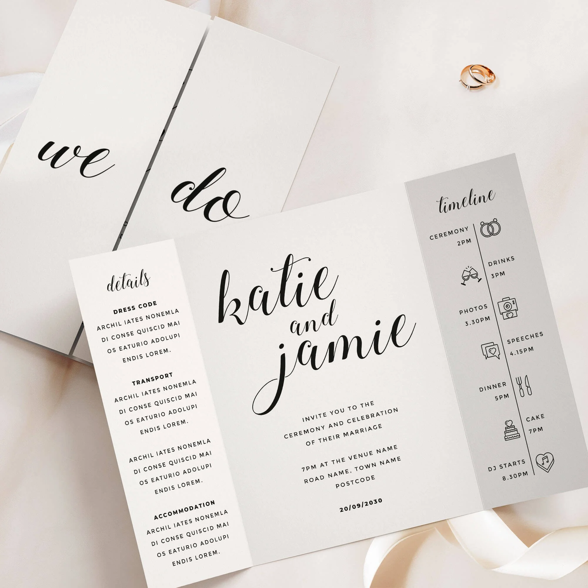
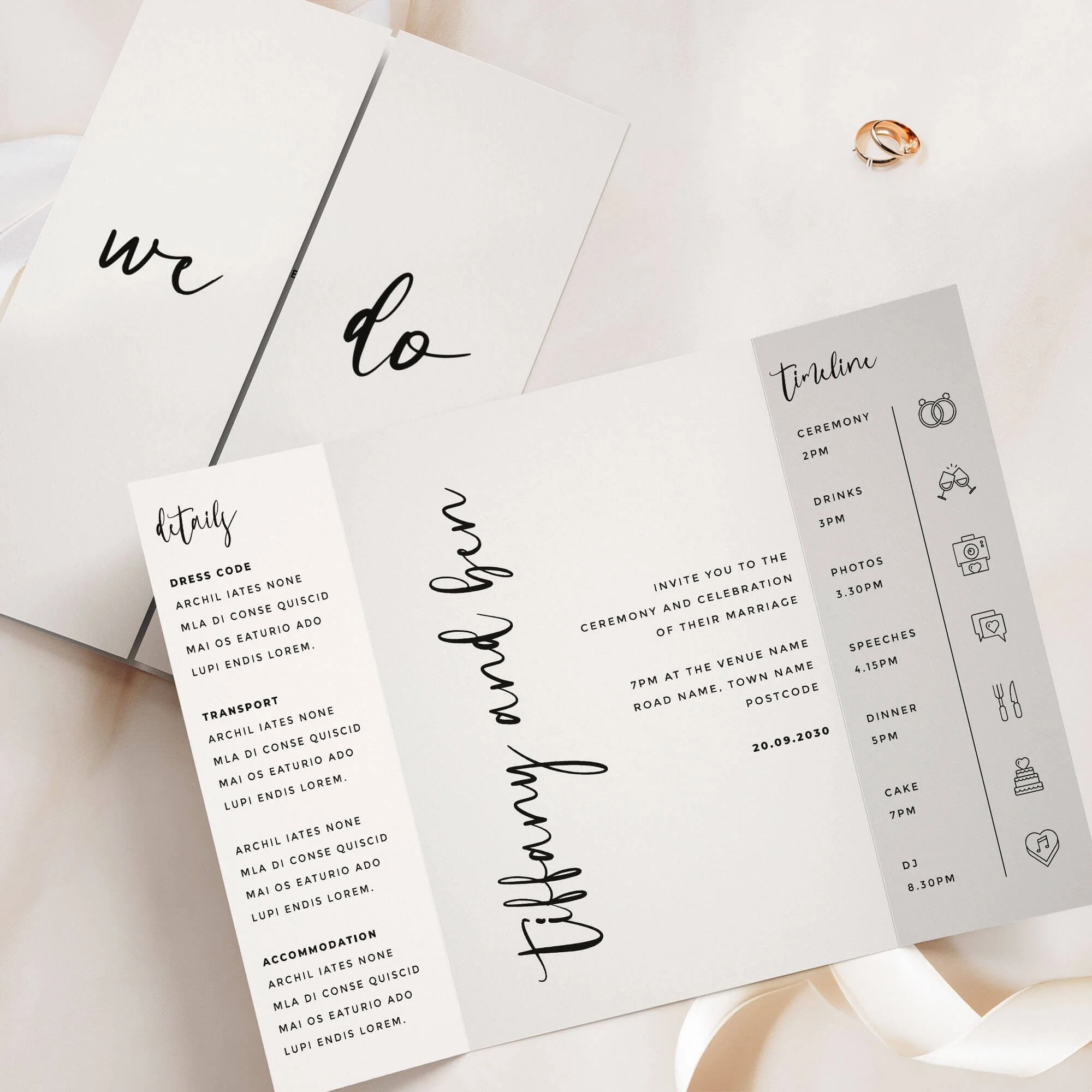
Calligraphy Wedding Invitations
Flowing calligraphy script. View the complete Calligraphy wedding stationery collection →

⭐️⭐️⭐️⭐️⭐️
Read what 1000s of happy couples say about us →
Add a playful and modern touch to your wedding with our Calligraphy Collection invitation. Featuring a lively calligraphy-style font, this design blends elegance with fun, making it ideal for couples seeking stylish yet approachable wedding stationery. Designed and handled personally by Harry & Ami – every order is managed with care until you’re fully happy.
What’s Included?
– Wedding Invitations in your chosen design, printed on 300gsm off-white tactile paper.
– Plain white envelopes are included free of charge. Prefer colour envelopes? Browse colour envelope options.
– Full design service included. We create your design for you and send digital proofs, with revisions until you’re happy.
– Free standard UK delivery for a limited time.
How to Order
– Simply select the quantity of Wedding Invitations you need and complete your purchase. You’re in safe hands.
– Once your order is placed, we’ll personally email you within 1 business day to request your wording (we’ll also include a helpful example of how to send it). If you already have it ready, feel free to add it at checkout in the personalisation box.
– We’ll take care of the full design for you and send a digital proof (PDF) within one business day. Need any changes? No problem at all – we’re happy to tweak it until you’re completely happy. Nothing is printed until you give us the final go-ahead.
– It’s just the two of us here – myself (Harry) and my wife (Ami) – and we personally handle every order with care. We’re here to make it easy and stress-free for you.
Please note: If you need separate Day and Evening Wedding Invitations (with different wording), please add them to your basket as separate items. For example, add 20 Day and 30 Evening cards individually, rather than one combined quantity of 50.
What Can I Customise?
– All wording can be changed to suit your wedding details.
– Need more space for wording? A small amount of additional wording can be printed on the reverse of the invitation, included in the price. This space is designed for a short overflow note, such as a brief RSVP line or a small message about gifts. As part of the invitation design, we include a centred text box that fits up to 150 characters (approximately two short sentences). This layout is fixed so the wording remains balanced with the design. If you need to include more detailed guest information (accommodation, travel, timings etc.), we recommend adding one of our matching information cards, which can be ordered by clicking here.
– QR codes can be added (please note: we can’t change the colour of the QR code and can only use the file you provide).
– Colour changes may be possible on some designs. Generally, text-only designs can be colour-edited, while illustrated ones cannot, but feel free to message us to check.
Guest Name Printing
Normally, your invitation might read something like "Sarah and James invite you to the ceremony and celebration of their marriage", but with guest name printing, we replace that with your guest's actual name, so it reads "Sarah and James invite Emily and Tom to the ceremony and celebration of their marriage" instead — personalised for exactly who's being invited. If more than one person is invited on the same card (a couple, a family, or a group of friends) we can include all of their names together, and this still counts as just one guest name for pricing, however many you list — we'll always make sure everything fits neatly on a single line, so it looks beautiful every time.
Want some invitations with names and some without? For example, if you've ordered 50 invitations but only have 45 names ready, simply select guest name printing from the dropdown as normal — we'll use your full list, and any spares will be left with a gap for you to handwrite a name yourself. Handy for any last-minute additions to your guest list.
Add Matching RSVP Cards
An RSVP card is how your guests let you know whether they can attend (“RSVP" simply means "please reply.”) Your guests fill in the card to confirm they're coming (and often note things like dietary requirements), then post it back to you using the free envelope provided, so you know your final numbers in good time for your venue and caterer.
Complete your suite with RSVP cards printed in the same design as your invitations, so your whole first impression feels considered and coordinated. Each is an A7 card supplied with a free envelope, ready for your guests to reply by post.
Dimensions
– A6 size (105mm x 148mm).
– Prefer a larger size? You can also order this design in A5, click here for pricing and details.
Paper Type & Sustainability
Your Wedding Invitations are digitally printed on 300gsm luxury off-white, tactile paper. Each order includes plain white envelopes free of charge.
Please note: any silver or gold elements are printed digitally (not foil).
Wedding Invitation paper details:
– Elemental Chlorine Free
– FSC® Mix Certified
– Acid Free
– Free from Heavy Metals
– Long Life
– Contains Selected Secondary Fibres
Are Samples Available?
Yes, we offer non-personalised samples for many of our designs. Browse our wedding stationery samples to see the quality before you order.
Matching Stationery
View the full Calligraphy Collection for matching wedding stationery in this design, or browse all Wedding Invitations to explore more styles.
Turnaround Times
– Once we receive your order, we’ll message you for your wording. After we have it, you’ll receive a digital proof within 1 business day (often same day, depending on timing).
– If your order includes a bespoke venue illustration, please allow up to 2 additional days for your proof.
– Need changes? Each round of amends takes 1 business day. On average, allow around a week for the full design process, depending on how quickly we receive your feedback.
– Once you approve your design, printing usually takes 1–2 business days, and delivery 1–3 business days. We recommend allowing up to 2 weeks total to cover any unexpected courier delays.
– Need it sooner? We offer faster tracked delivery, please get in touch for pricing and availability.
Important Details
– If you have any concerns at all, please don’t hesitate to reach out – we genuinely want you to love your stationery. In the rare event of courier damage or a lost parcel, we’ll always ensure your items are reprinted and resent, so you can feel confident you’ll receive exactly what you’ve paid for.
– Full refunds cannot be offered once a digital file or physical item has been sent, as every item is personalised.
– Colours may appear different in print than on screen because printing and digital displays use different colour processes and values.
– Colours may vary between samples, orders, and batches – similar to wallpaper printing, which requires single-batch orders for consistency.
– All images, designs, and product descriptions on our website are protected by copyright. They may not be edited, copied, recreated, or used for personal or commercial purposes without permission. This includes reproducing wording or designs.
– Sharing our products on social media is allowed only if you tag us clearly. We monitor for infringement closely. Unauthorised copying or use of our designs or descriptions will be met with legal action. H&A.
⭐️⭐️⭐️⭐️⭐️
Read what 1000s of happy couples say about us →
Elevate your wedding with the Calligraphy Collection gatefold invitation, featuring elegant black and white minimal design with modern handwritten typography. Perfect for contemporary couples who appreciate a clean, timeless style with a personal touch of sophisticated calligraphy. Designed and handled personally by Harry & Ami – every order is managed with care until you’re fully happy.
What’s Included?
– Gatefold Wedding Invitations in your chosen design, printed on 300gsm off-white tactile paper.
– Plain white envelopes are included free of charge. Prefer colour envelopes? Browse colour envelope options.
– Full design service included. We create your design for you and send digital proofs, with revisions until you’re happy.
– Free standard UK delivery for a limited time.
How to Order
– Simply select the quantity of Gatefold Wedding Invitations you need and complete your purchase. You’re in safe hands.
– Once your order is placed, we’ll personally email you within 1 business day to request your wording (we’ll also include a helpful example of how to send it).
– We’ll take care of the full design for you and send a digital proof (PDF) within one business day. Need any changes? No problem at all – we’re happy to tweak it until you’re completely happy. Nothing is printed until you give us the final go-ahead.
– It’s just the two of us here – myself (Harry) and my wife (Ami) – and we personally handle every order with care. We’re here to make it easy and stress-free for you.
Please note: If you need separate Day and Evening Wedding Invitations (with different wording), please add them to your basket as separate items. For example, add 20 Day and 30 Evening cards individually, rather than one combined quantity of 50.
What Can I Customise?
– Want to change the wording on the front of the gatefold (e.g., “We Do”)? No problem! You can personalise it with your names, initials, or other wording you’d prefer.
– Prefer extra wording instead of the timeline section? We can swap it out for wording more meaningful to you.
– The text on the details panel is completely customisable – feel free to change it to suit your needs and all the wording on the middle panel can be tailored to better reflect your information.
– Choose from over 50 different wedding related icons to fully personalise your Order of the Day Timeline.
– Need more space for wording? We offer text-only printing on the back at no extra cost.
– QR codes can be added (please note: we can’t change the colour of the QR code and can only use the file you provide).
– Colour changes may be possible on some designs. Generally, text-only designs can be colour-edited, while illustrated ones cannot, but feel free to message us to check.
Guest Name Printing
Normally, your invitation might read something like "Sarah and James invite you to the ceremony and celebration of their marriage", but with guest name printing, we replace that with your guest's actual name, so it reads "Sarah and James invite Emily and Tom to the ceremony and celebration of their marriage" instead — personalised for exactly who's being invited. If more than one person is invited on the same card (a couple, a family, or a group of friends) we can include all of their names together, and this still counts as just one guest name for pricing, however many you list — we'll always make sure everything fits neatly on a single line, so it looks beautiful every time.
Want some invitations with names and some without? For example, if you've ordered 50 invitations but only have 45 names ready, simply select guest name printing from the dropdown as normal — we'll use your full list, and any spares will be left with a gap for you to handwrite a name yourself. Handy for any last-minute additions to your guest list.
Add Matching RSVP Cards
An RSVP card is how your guests let you know whether they can attend (“RSVP" simply means "please reply.”) Your guests fill in the card to confirm they're coming (and often note things like dietary requirements), then post it back to you using the free envelope provided, so you know your final numbers in good time for your venue and caterer.
Complete your suite with RSVP cards printed in the same design as your invitations, so your whole first impression feels considered and coordinated. Each is an A7 card supplied with a free envelope, ready for your guests to reply by post.
Dimensions
– A6 size (105mm x 148mm) once folded, A5 size when flat (148mm x 210mm).
– Prefer a larger size? You can also order this design in A5 (once folded), click here for pricing and details.
Paper Type & Sustainability
Your Gatefold Wedding Invitations are digitally printed on 300gsm luxury off-white, tactile paper. Each order includes plain white envelopes free of charge.
Please note: any silver or gold elements are printed digitally (not foil).
Wedding Invitation paper details:
– Elemental Chlorine Free
– FSC® Mix Certified
– Acid Free
– Free from Heavy Metals
– Long Life
– Contains Selected Secondary Fibres
Are Samples Available?
Yes, we offer non-personalised samples for many of our designs. Browse our wedding stationery samples to see the quality before you order.
Matching Stationery
View the full Calligraphy Collection for matching wedding stationery in this design, or browse all Gatefold Wedding Invitations to explore more styles.
Turnaround Times
– Once we receive your order, we’ll message you for your wording. After we have it, you’ll receive a digital proof within 1 business day (often same day, depending on timing).
– If your order includes a bespoke venue illustration, please allow up to 2 additional days for your proof.
– Need changes? Each round of amends takes 1 business day. On average, allow around a week for the full design process, depending on how quickly we receive your feedback.
– Once you approve your design, printing usually takes 1–2 business days, and delivery 1–3 business days. We recommend allowing up to 2 weeks total to cover any unexpected courier delays.
– Need it sooner? We offer faster tracked delivery, please get in touch for pricing and availability.
Important Details
– If you have any concerns at all, please don’t hesitate to reach out – we genuinely want you to love your stationery. In the rare event of courier damage or a lost parcel, we’ll always ensure your items are reprinted and resent, so you can feel confident you’ll receive exactly what you’ve paid for.
– Full refunds cannot be offered once a digital file or physical item has been sent, as every item is personalised.
– Colours may appear different in print than on screen because printing and digital displays use different colour processes and values.
– Colours may vary between samples, orders, and batches – similar to wallpaper printing, which requires single-batch orders for consistency.
– All images, designs, and product descriptions on our website are protected by copyright. They may not be edited, copied, recreated, or used for personal or commercial purposes without permission. This includes reproducing wording or designs.
– Sharing our products on social media is allowed only if you tag us clearly. We monitor for infringement closely. Unauthorised copying or use of our designs or descriptions will be met with legal action. H&A.

⭐️⭐️⭐️⭐️⭐️
Read what 1000s of happy couples say about us →
The Calligraphy Collection concertina wedding invitation showcases a bold and expressive script style, with fun, flowing calligraphy-style typography taking centre stage. Set against a clean, minimalist background, this modern design brings personality and flair while keeping the overall look fresh and contemporary. With its all-in-one layout and tear-off RSVP card, it’s a stylish yet functional choice for couples who love modern simplicity with a creative twist. Designed and handled personally by Harry & Ami – every order is managed with care until you’re fully happy.
What’s Included?
– Concertina Wedding Invitations in your chosen design, printed on 300gsm off-white tactile paper. Each invitation includes a tear-off RSVP card as part of the design. If you'd prefer guests to RSVP via QR code or email, we can replace the tear-off panel with a text-only version instead.
– C6 plain white envelopes are included free of charge. Prefer colour envelopes? Browse colour envelope options.
– Full design service included. We create your design for you and send digital proofs, with revisions until you’re happy.
– Free standard UK delivery for a limited time.
How to Order
– Simply select the quantity of Concertina Wedding Invitations you need and complete your purchase. You’re in safe hands.
– Once your order is placed, we’ll personally email you within 1 business day to request your wording (we’ll also include a helpful example of how to send it).
– We’ll take care of the full design for you and send a digital proof (PDF) within one business day. Need any changes? No problem at all – we’re happy to tweak it until you’re completely happy. Nothing is printed until you give us the final go-ahead.
– It’s just the two of us here – myself (Harry) and my wife (Ami) – and we personally handle every order with care. We’re here to make it easy and stress-free for you.
Please note: If you need separate Day and Evening Wedding Invitations (with different wording), please add them to your basket as separate items. For example, add 20 Day and 30 Evening cards individually, rather than one combined quantity of 50.
What Can I Customise?
– If you’d prefer more space for wording, we can swap the timeline panel for additional text, or even replace the RSVP panel if it’s not needed.
– If you’ve selected double-sided printing, the details panel wording is fully customisable – use any text you prefer.
– Choose from over 50 different wedding related icons to fully personalise your Order of the Day Timeline.
– All text on the main invitation panel is editable to perfectly match your wedding wording preferences.
– QR codes can be added (please note: we can’t change the colour of the QR code and can only use the file you provide).
– Colour changes may be possible on some designs. Generally, text-only designs can be colour-edited, while illustrated ones cannot, but feel free to message us to check.
Guest Name Printing
Normally, your invitation might read something like "Sarah and James invite you to the ceremony and celebration of their marriage", but with guest name printing, we replace that with your guest's actual name, so it reads "Sarah and James invite Emily and Tom to the ceremony and celebration of their marriage" instead — personalised for exactly who's being invited. If more than one person is invited on the same card (a couple, a family, or a group of friends) we can include all of their names together, and this still counts as just one guest name for pricing, however many you list — we'll always make sure everything fits neatly on a single line, so it looks beautiful every time.
Want some invitations with names and some without? For example, if you've ordered 50 invitations but only have 45 names ready, simply select guest name printing from the dropdown as normal — we'll use your full list, and any spares will be left with a gap for you to handwrite a name yourself. Handy for any last-minute additions to your guest list.
Dimensions
– A6 once folded (105mm x 148mm), 420mm x 148mm when flat.
What are the 8 panels if I select double sided?
1. Cover panel – Typically features your names or initials.
2. Invitation panel – Includes the venue name, date, time, and other key details.
3. Timeline panel – Showcases your order of the day with icons (choose from 50 available).
4. RSVP panel – For guest responses.
5. Details panel 1 – Ideal for your gift wish, wedding website, or a QR code.
6. Details panel 2 – Can include dress code, travel directions, or accommodation info.
7. Details panel 3 – Often used for a menu or dietary notes.
8. Reverse of the RSVP panel – Typically features your return address.
Prefer fewer panels or want to customise? No problem! We can leave panels blank or swap them – for example, replacing the timeline with extra wording or other content.
What are the 4 panels if I select single sided?
1. Cover panel – Typically features your names or initials.
2. Invitation panel – Includes your venue name, date, time, and key details.
3. Timeline panel – Displays your order of the day using icons (we have 50 to choose from). This can be swapped for a details panel if preferred.
4. RSVP panel – Adapted into a single-sided postcard format for the single-sided option.
Want to make changes? We can leave panels blank or customise the layout—such as removing the timeline to include additional wording or other information.
RSVP Panel
Your guests can easily tear off the RSVP panel along the perforated edge, which will already have your return address printed. If you’ve selected double-sided printing, the address will appear on the reverse; for single-sided, it will be printed on the front. The RSVP includes customisable sections for names, accept/decline options, dietary requirements, song choices, and more – tailored to suit your needs. If you would like a bespoke menu choice RSVP panel please get in touch for pricing.
Paper Type & Sustainability
Your Concertina Wedding Invitations are digitally printed on 300gsm luxury off-white, tactile paper. Each order includes plain white envelopes free of charge.
Please note: any silver or gold elements are printed digitally (not foil).
Wedding Invitation paper details:
– Elemental Chlorine Free
– FSC® Mix Certified
– Acid Free
– Free from Heavy Metals
– Long Life
– Contains Selected Secondary Fibres
Are Samples Available?
Yes, we offer non-personalised samples for many of our designs. Browse our wedding stationery samples to see the quality before you order.
Matching Stationery
View the full Calligraphy Collection for matching wedding stationery in this design, or browse all Concertina Wedding Invitations to explore more styles.
Turnaround Times
– Once we receive your order, we’ll message you for your wording. After we have it, you’ll receive a digital proof within 1 business day (often same day, depending on timing).
– If your order includes a bespoke venue illustration, please allow up to 2 additional days for your proof.
– Need changes? Each round of amends takes 1 business day. On average, allow around a week for the full design process, depending on how quickly we receive your feedback.
– Once you approve your design, printing usually takes 1–2 business days, and delivery 1–3 business days. We recommend allowing up to 2 weeks total to cover any unexpected courier delays.
– Need it sooner? We offer faster tracked delivery, please get in touch for pricing and availability.
Important Details
– If you have any concerns at all, please don’t hesitate to reach out – we genuinely want you to love your stationery. In the rare event of courier damage or a lost parcel, we’ll always ensure your items are reprinted and resent, so you can feel confident you’ll receive exactly what you’ve paid for.
– Full refunds cannot be offered once a digital file or physical item has been sent, as every item is personalised.
– Colours may appear different in print than on screen because printing and digital displays use different colour processes and values.
– Colours may vary between samples, orders, and batches – similar to wallpaper printing, which requires single-batch orders for consistency.
– All images, designs, and product descriptions on our website are protected by copyright. They may not be edited, copied, recreated, or used for personal or commercial purposes without permission. This includes reproducing wording or designs.
– Sharing our products on social media is allowed only if you tag us clearly. We monitor for infringement closely. Unauthorised copying or use of our designs or descriptions will be met with legal action. H&A.
Script Wedding Invitations
Elegant script lettering. View the complete Script wedding stationery collection →

⭐️⭐️⭐️⭐️⭐️
Read what 1000s of happy couples say about us →
Make a bold, modern statement with our Script Collection wedding invitations. This striking black and white design features elegant calligraphy flowing vertically up the page – perfect for couples who love clean, contemporary styling with a creative twist. A standout within our typography and monochrome ranges, it balances simplicity with artistic flair. Designed and handled personally by Harry & Ami – every order is managed with care until you’re fully happy.
What’s Included?
– Wedding Invitations in your chosen design, printed on 300gsm off-white tactile paper.
– Plain white envelopes are included free of charge. Prefer colour envelopes? Browse colour envelope options.
– Full design service included. We create your design for you and send digital proofs, with revisions until you’re happy.
– Free standard UK delivery for a limited time.
How to Order
– Simply select the quantity of Wedding Invitations you need and complete your purchase. You’re in safe hands.
– Once your order is placed, we’ll personally email you within 1 business day to request your wording (we’ll also include a helpful example of how to send it). If you already have it ready, feel free to add it at checkout in the personalisation box.
– We’ll take care of the full design for you and send a digital proof (PDF) within one business day. Need any changes? No problem at all – we’re happy to tweak it until you’re completely happy. Nothing is printed until you give us the final go-ahead.
– It’s just the two of us here – myself (Harry) and my wife (Ami) – and we personally handle every order with care. We’re here to make it easy and stress-free for you.
Please note: If you need separate Day and Evening Wedding Invitations (with different wording), please add them to your basket as separate items. For example, add 20 Day and 30 Evening cards individually, rather than one combined quantity of 50.
What Can I Customise?
– All wording can be changed to suit your wedding details.
– Need more space for wording? A small amount of additional wording can be printed on the reverse of the invitation, included in the price. This space is designed for a short overflow note, such as a brief RSVP line or a small message about gifts. As part of the invitation design, we include a centred text box that fits up to 150 characters (approximately two short sentences). This layout is fixed so the wording remains balanced with the design. If you need to include more detailed guest information (accommodation, travel, timings etc.), we recommend adding one of our matching information cards, which can be ordered by clicking here.
– QR codes can be added (please note: we can’t change the colour of the QR code and can only use the file you provide).
– Colour changes may be possible on some designs. Generally, text-only designs can be colour-edited, while illustrated ones cannot, but feel free to message us to check.
Guest Name Printing
Normally, your invitation might read something like "Sarah and James invite you to the ceremony and celebration of their marriage", but with guest name printing, we replace that with your guest's actual name, so it reads "Sarah and James invite Emily and Tom to the ceremony and celebration of their marriage" instead — personalised for exactly who's being invited. If more than one person is invited on the same card (a couple, a family, or a group of friends) we can include all of their names together, and this still counts as just one guest name for pricing, however many you list — we'll always make sure everything fits neatly on a single line, so it looks beautiful every time.
Want some invitations with names and some without? For example, if you've ordered 50 invitations but only have 45 names ready, simply select guest name printing from the dropdown as normal — we'll use your full list, and any spares will be left with a gap for you to handwrite a name yourself. Handy for any last-minute additions to your guest list.
Add Matching RSVP Cards
An RSVP card is how your guests let you know whether they can attend (“RSVP" simply means "please reply.”) Your guests fill in the card to confirm they're coming (and often note things like dietary requirements), then post it back to you using the free envelope provided, so you know your final numbers in good time for your venue and caterer.
Complete your suite with RSVP cards printed in the same design as your invitations, so your whole first impression feels considered and coordinated. Each is an A7 card supplied with a free envelope, ready for your guests to reply by post.
Dimensions
– A6 size (105mm x 148mm).
– Prefer a larger size? You can also order this design in A5, click here for pricing and details.
Paper Type & Sustainability
Your Wedding Invitations are digitally printed on 300gsm luxury off-white, tactile paper. Each order includes plain white envelopes free of charge.
Please note: any silver or gold elements are printed digitally (not foil).
Wedding Invitation paper details:
– Elemental Chlorine Free
– FSC® Mix Certified
– Acid Free
– Free from Heavy Metals
– Long Life
– Contains Selected Secondary Fibres
Are Samples Available?
Yes, we offer non-personalised samples for many of our designs. Browse our wedding stationery samples to see the quality before you order.
Matching Stationery
View the full Script Collection for matching wedding stationery in this design, or browse all Wedding Invitations to explore more styles.
Turnaround Times
– Once we receive your order, we’ll message you for your wording. After we have it, you’ll receive a digital proof within 1 business day (often same day, depending on timing).
– If your order includes a bespoke venue illustration, please allow up to 2 additional days for your proof.
– Need changes? Each round of amends takes 1 business day. On average, allow around a week for the full design process, depending on how quickly we receive your feedback.
– Once you approve your design, printing usually takes 1–2 business days, and delivery 1–3 business days. We recommend allowing up to 2 weeks total to cover any unexpected courier delays.
– Need it sooner? We offer faster tracked delivery, please get in touch for pricing and availability.
Important Details
– If you have any concerns at all, please don’t hesitate to reach out – we genuinely want you to love your stationery. In the rare event of courier damage or a lost parcel, we’ll always ensure your items are reprinted and resent, so you can feel confident you’ll receive exactly what you’ve paid for.
– Full refunds cannot be offered once a digital file or physical item has been sent, as every item is personalised.
– Colours may appear different in print than on screen because printing and digital displays use different colour processes and values.
– Colours may vary between samples, orders, and batches – similar to wallpaper printing, which requires single-batch orders for consistency.
– All images, designs, and product descriptions on our website are protected by copyright. They may not be edited, copied, recreated, or used for personal or commercial purposes without permission. This includes reproducing wording or designs.
– Sharing our products on social media is allowed only if you tag us clearly. We monitor for infringement closely. Unauthorised copying or use of our designs or descriptions will be met with legal action. H&A.
⭐️⭐️⭐️⭐️⭐️
Read what 1000s of happy couples say about us →
The Script Collection gatefold invitation is a striking blend of modern minimalism and artistic typography. Designed in timeless black and white, the couple’s names are displayed vertically in elegant calligraphy-style script, creating a bold yet refined layout. Ideal for contemporary weddings, this invitation offers a clean, monochrome aesthetic that feels both fashion-forward and effortlessly sophisticated. Designed and handled personally by Harry & Ami – every order is managed with care until you’re fully happy.
What’s Included?
– Gatefold Wedding Invitations in your chosen design, printed on 300gsm off-white tactile paper.
– Plain white envelopes are included free of charge. Prefer colour envelopes? Browse colour envelope options.
– Full design service included. We create your design for you and send digital proofs, with revisions until you’re happy.
– Free standard UK delivery for a limited time.
How to Order
– Simply select the quantity of Gatefold Wedding Invitations you need and complete your purchase. You’re in safe hands.
– Once your order is placed, we’ll personally email you within 1 business day to request your wording (we’ll also include a helpful example of how to send it).
– We’ll take care of the full design for you and send a digital proof (PDF) within one business day. Need any changes? No problem at all – we’re happy to tweak it until you’re completely happy. Nothing is printed until you give us the final go-ahead.
– It’s just the two of us here – myself (Harry) and my wife (Ami) – and we personally handle every order with care. We’re here to make it easy and stress-free for you.
Please note: If you need separate Day and Evening Wedding Invitations (with different wording), please add them to your basket as separate items. For example, add 20 Day and 30 Evening cards individually, rather than one combined quantity of 50.
What Can I Customise?
– Want to change the wording on the front of the gatefold (e.g., “We Do”)? No problem! You can personalise it with your names, initials, or other wording you’d prefer.
– Prefer extra wording instead of the timeline section? We can swap it out for wording more meaningful to you.
– The text on the details panel is completely customisable – feel free to change it to suit your needs and all the wording on the middle panel can be tailored to better reflect your information.
– Choose from over 50 different wedding related icons to fully personalise your Order of the Day Timeline.
– Need more space for wording? We offer text-only printing on the back at no extra cost.
– QR codes can be added (please note: we can’t change the colour of the QR code and can only use the file you provide).
– Colour changes may be possible on some designs. Generally, text-only designs can be colour-edited, while illustrated ones cannot, but feel free to message us to check.
Guest Name Printing
Normally, your invitation might read something like "Sarah and James invite you to the ceremony and celebration of their marriage", but with guest name printing, we replace that with your guest's actual name, so it reads "Sarah and James invite Emily and Tom to the ceremony and celebration of their marriage" instead — personalised for exactly who's being invited. If more than one person is invited on the same card (a couple, a family, or a group of friends) we can include all of their names together, and this still counts as just one guest name for pricing, however many you list — we'll always make sure everything fits neatly on a single line, so it looks beautiful every time.
Want some invitations with names and some without? For example, if you've ordered 50 invitations but only have 45 names ready, simply select guest name printing from the dropdown as normal — we'll use your full list, and any spares will be left with a gap for you to handwrite a name yourself. Handy for any last-minute additions to your guest list.
Add Matching RSVP Cards
An RSVP card is how your guests let you know whether they can attend (“RSVP" simply means "please reply.”) Your guests fill in the card to confirm they're coming (and often note things like dietary requirements), then post it back to you using the free envelope provided, so you know your final numbers in good time for your venue and caterer.
Complete your suite with RSVP cards printed in the same design as your invitations, so your whole first impression feels considered and coordinated. Each is an A7 card supplied with a free envelope, ready for your guests to reply by post.
Dimensions
– A6 size (105mm x 148mm) once folded, A5 size when flat (148mm x 210mm).
– Prefer a larger size? You can also order this design in A5 (once folded), click here for pricing and details.
Paper Type & Sustainability
Your Gatefold Wedding Invitations are digitally printed on 300gsm luxury off-white, tactile paper. Each order includes plain white envelopes free of charge.
Please note: any silver or gold elements are printed digitally (not foil).
Wedding Invitation paper details:
– Elemental Chlorine Free
– FSC® Mix Certified
– Acid Free
– Free from Heavy Metals
– Long Life
– Contains Selected Secondary Fibres
Are Samples Available?
Yes, we offer non-personalised samples for many of our designs. Browse our wedding stationery samples to see the quality before you order.
Matching Stationery
View the full Script Collection for matching wedding stationery in this design, or browse all Gatefold Wedding Invitations to explore more styles.
Turnaround Times
– Once we receive your order, we’ll message you for your wording. After we have it, you’ll receive a digital proof within 1 business day (often same day, depending on timing).
– If your order includes a bespoke venue illustration, please allow up to 2 additional days for your proof.
– Need changes? Each round of amends takes 1 business day. On average, allow around a week for the full design process, depending on how quickly we receive your feedback.
– Once you approve your design, printing usually takes 1–2 business days, and delivery 1–3 business days. We recommend allowing up to 2 weeks total to cover any unexpected courier delays.
– Need it sooner? We offer faster tracked delivery, please get in touch for pricing and availability.
Important Details
– If you have any concerns at all, please don’t hesitate to reach out – we genuinely want you to love your stationery. In the rare event of courier damage or a lost parcel, we’ll always ensure your items are reprinted and resent, so you can feel confident you’ll receive exactly what you’ve paid for.
– Full refunds cannot be offered once a digital file or physical item has been sent, as every item is personalised.
– Colours may appear different in print than on screen because printing and digital displays use different colour processes and values.
– Colours may vary between samples, orders, and batches – similar to wallpaper printing, which requires single-batch orders for consistency.
– All images, designs, and product descriptions on our website are protected by copyright. They may not be edited, copied, recreated, or used for personal or commercial purposes without permission. This includes reproducing wording or designs.
– Sharing our products on social media is allowed only if you tag us clearly. We monitor for infringement closely. Unauthorised copying or use of our designs or descriptions will be met with legal action. H&A.
Monogram Wedding Invitations
Statement monogram styling. View the complete Monogram wedding stationery collection →

⭐️⭐️⭐️⭐️⭐️
Read what 1000s of happy couples say about us →
Elegant and refined, our Monogram wedding invitations pair classic black and white styling with a delicate botanical branch monogram for a minimal yet personal touch. This timeless design offers a fresh take on our monogram and monochrome collections, perfect for modern couples seeking understated sophistication with a natural twist. Designed and handled personally by Harry & Ami – every order is managed with care until you’re fully happy.
What’s Included?
– Wedding Invitations in your chosen design, printed on 300gsm off-white tactile paper.
– Plain white envelopes are included free of charge. Prefer colour envelopes? Browse colour envelope options.
– Full design service included. We create your design for you and send digital proofs, with revisions until you’re happy.
– Free standard UK delivery for a limited time.
How to Order
– Simply select the quantity of Wedding Invitations you need and complete your purchase. You’re in safe hands.
– Once your order is placed, we’ll personally email you within 1 business day to request your wording (we’ll also include a helpful example of how to send it). If you already have it ready, feel free to add it at checkout in the personalisation box.
– We’ll take care of the full design for you and send a digital proof (PDF) within one business day. Need any changes? No problem at all – we’re happy to tweak it until you’re completely happy. Nothing is printed until you give us the final go-ahead.
– It’s just the two of us here – myself (Harry) and my wife (Ami) – and we personally handle every order with care. We’re here to make it easy and stress-free for you.
Please note: If you need separate Day and Evening Wedding Invitations (with different wording), please add them to your basket as separate items. For example, add 20 Day and 30 Evening cards individually, rather than one combined quantity of 50.
What Can I Customise?
– All wording can be changed to suit your wedding details.
– Need more space for wording? A small amount of additional wording can be printed on the reverse of the invitation, included in the price. This space is designed for a short overflow note, such as a brief RSVP line or a small message about gifts. As part of the invitation design, we include a centred text box that fits up to 150 characters (approximately two short sentences). This layout is fixed so the wording remains balanced with the design. If you need to include more detailed guest information (accommodation, travel, timings etc.), we recommend adding one of our matching information cards, which can be ordered by clicking here.
– QR codes can be added (please note: we can’t change the colour of the QR code and can only use the file you provide).
– Colour changes may be possible on some designs. Generally, text-only designs can be colour-edited, while illustrated ones cannot, but feel free to message us to check.
Guest Name Printing
Normally, your invitation might read something like "Sarah and James invite you to the ceremony and celebration of their marriage", but with guest name printing, we replace that with your guest's actual name, so it reads "Sarah and James invite Emily and Tom to the ceremony and celebration of their marriage" instead — personalised for exactly who's being invited. If more than one person is invited on the same card (a couple, a family, or a group of friends) we can include all of their names together, and this still counts as just one guest name for pricing, however many you list — we'll always make sure everything fits neatly on a single line, so it looks beautiful every time.
Want some invitations with names and some without? For example, if you've ordered 50 invitations but only have 45 names ready, simply select guest name printing from the dropdown as normal — we'll use your full list, and any spares will be left with a gap for you to handwrite a name yourself. Handy for any last-minute additions to your guest list.
Add Matching RSVP Cards
An RSVP card is how your guests let you know whether they can attend (“RSVP" simply means "please reply.”) Your guests fill in the card to confirm they're coming (and often note things like dietary requirements), then post it back to you using the free envelope provided, so you know your final numbers in good time for your venue and caterer.
Complete your suite with RSVP cards printed in the same design as your invitations, so your whole first impression feels considered and coordinated. Each is an A7 card supplied with a free envelope, ready for your guests to reply by post.
Dimensions
– A6 size (105mm x 148mm).
– Prefer a larger size? You can also order this design in A5, click here for pricing and details.
Paper Type & Sustainability
Your Wedding Invitations are digitally printed on 300gsm luxury off-white, tactile paper. Each order includes plain white envelopes free of charge.
Please note: any silver or gold elements are printed digitally (not foil).
Wedding Invitation paper details:
– Elemental Chlorine Free
– FSC® Mix Certified
– Acid Free
– Free from Heavy Metals
– Long Life
– Contains Selected Secondary Fibres
Are Samples Available?
Yes, we offer non-personalised samples for many of our designs. Browse our wedding stationery samples to see the quality before you order.
Matching Stationery
View the full Monogram Collection for matching wedding stationery in this design, or browse all Wedding Invitations to explore more styles.
Turnaround Times
– Once we receive your order, we’ll message you for your wording. After we have it, you’ll receive a digital proof within 1 business day (often same day, depending on timing).
– If your order includes a bespoke venue illustration, please allow up to 2 additional days for your proof.
– Need changes? Each round of amends takes 1 business day. On average, allow around a week for the full design process, depending on how quickly we receive your feedback.
– Once you approve your design, printing usually takes 1–2 business days, and delivery 1–3 business days. We recommend allowing up to 2 weeks total to cover any unexpected courier delays.
– Need it sooner? We offer faster tracked delivery, please get in touch for pricing and availability.
Important Details
– If you have any concerns at all, please don’t hesitate to reach out – we genuinely want you to love your stationery. In the rare event of courier damage or a lost parcel, we’ll always ensure your items are reprinted and resent, so you can feel confident you’ll receive exactly what you’ve paid for.
– Full refunds cannot be offered once a digital file or physical item has been sent, as every item is personalised.
– Colours may appear different in print than on screen because printing and digital displays use different colour processes and values.
– Colours may vary between samples, orders, and batches – similar to wallpaper printing, which requires single-batch orders for consistency.
– All images, designs, and product descriptions on our website are protected by copyright. They may not be edited, copied, recreated, or used for personal or commercial purposes without permission. This includes reproducing wording or designs.
– Sharing our products on social media is allowed only if you tag us clearly. We monitor for infringement closely. Unauthorised copying or use of our designs or descriptions will be met with legal action. H&A.
⭐️⭐️⭐️⭐️⭐️
Read what 1000s of happy couples say about us →
Celebrate your love with the Monogram Collection gatefold invitation, featuring a sophisticated black and white design centered around a custom monogram. This modern yet timeless style combines sleek typography with clean lines, perfect for couples seeking a personalised and elegant wedding stationery. Designed and handled personally by Harry & Ami – every order is managed with care until you’re fully happy.
What’s Included?
– Gatefold Wedding Invitations in your chosen design, printed on 300gsm off-white tactile paper.
– Plain white envelopes are included free of charge. Prefer colour envelopes? Browse colour envelope options.
– Full design service included. We create your design for you and send digital proofs, with revisions until you’re happy.
– Free standard UK delivery for a limited time.
How to Order
– Simply select the quantity of Gatefold Wedding Invitations you need and complete your purchase. You’re in safe hands.
– Once your order is placed, we’ll personally email you within 1 business day to request your wording (we’ll also include a helpful example of how to send it).
– We’ll take care of the full design for you and send a digital proof (PDF) within one business day. Need any changes? No problem at all – we’re happy to tweak it until you’re completely happy. Nothing is printed until you give us the final go-ahead.
– It’s just the two of us here – myself (Harry) and my wife (Ami) – and we personally handle every order with care. We’re here to make it easy and stress-free for you.
Please note: If you need separate Day and Evening Wedding Invitations (with different wording), please add them to your basket as separate items. For example, add 20 Day and 30 Evening cards individually, rather than one combined quantity of 50.
What Can I Customise?
– Want to change the wording on the front of the gatefold (e.g., “We Do”)? No problem! You can personalise it with your names, initials, or other wording you’d prefer.
– Prefer extra wording instead of the timeline section? We can swap it out for wording more meaningful to you.
– The text on the details panel is completely customisable – feel free to change it to suit your needs and all the wording on the middle panel can be tailored to better reflect your information.
– Choose from over 50 different wedding related icons to fully personalise your Order of the Day Timeline.
– Need more space for wording? We offer text-only printing on the back at no extra cost.
– QR codes can be added (please note: we can’t change the colour of the QR code and can only use the file you provide).
– Colour changes may be possible on some designs. Generally, text-only designs can be colour-edited, while illustrated ones cannot, but feel free to message us to check.
Guest Name Printing
Normally, your invitation might read something like "Sarah and James invite you to the ceremony and celebration of their marriage", but with guest name printing, we replace that with your guest's actual name, so it reads "Sarah and James invite Emily and Tom to the ceremony and celebration of their marriage" instead — personalised for exactly who's being invited. If more than one person is invited on the same card (a couple, a family, or a group of friends) we can include all of their names together, and this still counts as just one guest name for pricing, however many you list — we'll always make sure everything fits neatly on a single line, so it looks beautiful every time.
Want some invitations with names and some without? For example, if you've ordered 50 invitations but only have 45 names ready, simply select guest name printing from the dropdown as normal — we'll use your full list, and any spares will be left with a gap for you to handwrite a name yourself. Handy for any last-minute additions to your guest list.
Add Matching RSVP Cards
An RSVP card is how your guests let you know whether they can attend (“RSVP" simply means "please reply.”) Your guests fill in the card to confirm they're coming (and often note things like dietary requirements), then post it back to you using the free envelope provided, so you know your final numbers in good time for your venue and caterer.
Complete your suite with RSVP cards printed in the same design as your invitations, so your whole first impression feels considered and coordinated. Each is an A7 card supplied with a free envelope, ready for your guests to reply by post.
Dimensions
– A6 size (105mm x 148mm) once folded, A5 size when flat (148mm x 210mm).
– Prefer a larger size? You can also order this design in A5 (once folded), click here for pricing and details.
Paper Type & Sustainability
Your Gatefold Wedding Invitations are digitally printed on 300gsm luxury off-white, tactile paper. Each order includes plain white envelopes free of charge.
Please note: any silver or gold elements are printed digitally (not foil).
Wedding Invitation paper details:
– Elemental Chlorine Free
– FSC® Mix Certified
– Acid Free
– Free from Heavy Metals
– Long Life
– Contains Selected Secondary Fibres
Are Samples Available?
Yes, we offer non-personalised samples for many of our designs. Browse our wedding stationery samples to see the quality before you order.
Matching Stationery
View the full Monogram Collection for matching wedding stationery in this design, or browse all Gatefold Wedding Invitations to explore more styles.
Turnaround Times
– Once we receive your order, we’ll message you for your wording. After we have it, you’ll receive a digital proof within 1 business day (often same day, depending on timing).
– If your order includes a bespoke venue illustration, please allow up to 2 additional days for your proof.
– Need changes? Each round of amends takes 1 business day. On average, allow around a week for the full design process, depending on how quickly we receive your feedback.
– Once you approve your design, printing usually takes 1–2 business days, and delivery 1–3 business days. We recommend allowing up to 2 weeks total to cover any unexpected courier delays.
– Need it sooner? We offer faster tracked delivery, please get in touch for pricing and availability.
Important Details
– If you have any concerns at all, please don’t hesitate to reach out – we genuinely want you to love your stationery. In the rare event of courier damage or a lost parcel, we’ll always ensure your items are reprinted and resent, so you can feel confident you’ll receive exactly what you’ve paid for.
– Full refunds cannot be offered once a digital file or physical item has been sent, as every item is personalised.
– Colours may appear different in print than on screen because printing and digital displays use different colour processes and values.
– Colours may vary between samples, orders, and batches – similar to wallpaper printing, which requires single-batch orders for consistency.
– All images, designs, and product descriptions on our website are protected by copyright. They may not be edited, copied, recreated, or used for personal or commercial purposes without permission. This includes reproducing wording or designs.
– Sharing our products on social media is allowed only if you tag us clearly. We monitor for infringement closely. Unauthorised copying or use of our designs or descriptions will be met with legal action. H&A.

⭐️⭐️⭐️⭐️⭐️
Read what 1000s of happy couples say about us →
The Monogram Collection concertina wedding invitation offers a minimalist yet striking design, centred around a modern monogram of your initials. Clean lines, simple typography, and elegant spacing create a refined aesthetic that’s perfect for contemporary weddings. With an integrated tear-off RSVP card and four or eight panel format, it’s a practical and stylish choice. Designed and handled personally by Harry & Ami – every order is managed with care until you’re fully happy.
What’s Included?
– Concertina Wedding Invitations in your chosen design, printed on 300gsm off-white tactile paper. Each invitation includes a tear-off RSVP card as part of the design. If you'd prefer guests to RSVP via QR code or email, we can replace the tear-off panel with a text-only version instead.
– C6 plain white envelopes are included free of charge. Prefer colour envelopes? Browse colour envelope options.
– Full design service included. We create your design for you and send digital proofs, with revisions until you’re happy.
– Free standard UK delivery for a limited time.
How to Order
– Simply select the quantity of Concertina Wedding Invitations you need and complete your purchase. You’re in safe hands.
– Once your order is placed, we’ll personally email you within 1 business day to request your wording (we’ll also include a helpful example of how to send it).
– We’ll take care of the full design for you and send a digital proof (PDF) within one business day. Need any changes? No problem at all – we’re happy to tweak it until you’re completely happy. Nothing is printed until you give us the final go-ahead.
– It’s just the two of us here – myself (Harry) and my wife (Ami) – and we personally handle every order with care. We’re here to make it easy and stress-free for you.
Please note: If you need separate Day and Evening Wedding Invitations (with different wording), please add them to your basket as separate items. For example, add 20 Day and 30 Evening cards individually, rather than one combined quantity of 50.
What Can I Customise?
– If you’d prefer more space for wording, we can swap the timeline panel for additional text, or even replace the RSVP panel if it’s not needed.
– If you’ve selected double-sided printing, the details panel wording is fully customisable – use any text you prefer.
– Choose from over 50 different wedding related icons to fully personalise your Order of the Day Timeline.
– All text on the main invitation panel is editable to perfectly match your wedding wording preferences.
– QR codes can be added (please note: we can’t change the colour of the QR code and can only use the file you provide).
– Colour changes may be possible on some designs. Generally, text-only designs can be colour-edited, while illustrated ones cannot, but feel free to message us to check.
Guest Name Printing
Normally, your invitation might read something like "Sarah and James invite you to the ceremony and celebration of their marriage", but with guest name printing, we replace that with your guest's actual name, so it reads "Sarah and James invite Emily and Tom to the ceremony and celebration of their marriage" instead — personalised for exactly who's being invited. If more than one person is invited on the same card (a couple, a family, or a group of friends) we can include all of their names together, and this still counts as just one guest name for pricing, however many you list — we'll always make sure everything fits neatly on a single line, so it looks beautiful every time.
Want some invitations with names and some without? For example, if you've ordered 50 invitations but only have 45 names ready, simply select guest name printing from the dropdown as normal — we'll use your full list, and any spares will be left with a gap for you to handwrite a name yourself. Handy for any last-minute additions to your guest list.
Dimensions
– A6 once folded (105mm x 148mm), 420mm x 148mm when flat.
What are the 8 panels if I select double sided?
1. Cover panel – Typically features your names or initials.
2. Invitation panel – Includes the venue name, date, time, and other key details.
3. Timeline panel – Showcases your order of the day with icons (choose from 50 available).
4. RSVP panel – For guest responses.
5. Details panel 1 – Ideal for your gift wish, wedding website, or a QR code.
6. Details panel 2 – Can include dress code, travel directions, or accommodation info.
7. Details panel 3 – Often used for a menu or dietary notes.
8. Reverse of the RSVP panel – Typically features your return address.
Prefer fewer panels or want to customise? No problem! We can leave panels blank or swap them – for example, replacing the timeline with extra wording or other content.
What are the 4 panels if I select single sided?
1. Cover panel – Typically features your names or initials.
2. Invitation panel – Includes your venue name, date, time, and key details.
3. Timeline panel – Displays your order of the day using icons (we have 50 to choose from). This can be swapped for a details panel if preferred.
4. RSVP panel – Adapted into a single-sided postcard format for the single-sided option.
Want to make changes? We can leave panels blank or customise the layout—such as removing the timeline to include additional wording or other information.
RSVP Panel
Your guests can easily tear off the RSVP panel along the perforated edge, which will already have your return address printed. If you’ve selected double-sided printing, the address will appear on the reverse; for single-sided, it will be printed on the front. The RSVP includes customisable sections for names, accept/decline options, dietary requirements, song choices, and more – tailored to suit your needs. If you would like a bespoke menu choice RSVP panel please get in touch for pricing.
Paper Type & Sustainability
Your Concertina Wedding Invitations are digitally printed on 300gsm luxury off-white, tactile paper. Each order includes plain white envelopes free of charge.
Please note: any silver or gold elements are printed digitally (not foil).
Wedding Invitation paper details:
– Elemental Chlorine Free
– FSC® Mix Certified
– Acid Free
– Free from Heavy Metals
– Long Life
– Contains Selected Secondary Fibres
Are Samples Available?
Yes, we offer non-personalised samples for many of our designs. Browse our wedding stationery samples to see the quality before you order.
Matching Stationery
View the full Monogram Collection for matching wedding stationery in this design, or browse all Concertina Wedding Invitations to explore more styles.
Turnaround Times
– Once we receive your order, we’ll message you for your wording. After we have it, you’ll receive a digital proof within 1 business day (often same day, depending on timing).
– If your order includes a bespoke venue illustration, please allow up to 2 additional days for your proof.
– Need changes? Each round of amends takes 1 business day. On average, allow around a week for the full design process, depending on how quickly we receive your feedback.
– Once you approve your design, printing usually takes 1–2 business days, and delivery 1–3 business days. We recommend allowing up to 2 weeks total to cover any unexpected courier delays.
– Need it sooner? We offer faster tracked delivery, please get in touch for pricing and availability.
Important Details
– If you have any concerns at all, please don’t hesitate to reach out – we genuinely want you to love your stationery. In the rare event of courier damage or a lost parcel, we’ll always ensure your items are reprinted and resent, so you can feel confident you’ll receive exactly what you’ve paid for.
– Full refunds cannot be offered once a digital file or physical item has been sent, as every item is personalised.
– Colours may appear different in print than on screen because printing and digital displays use different colour processes and values.
– Colours may vary between samples, orders, and batches – similar to wallpaper printing, which requires single-batch orders for consistency.
– All images, designs, and product descriptions on our website are protected by copyright. They may not be edited, copied, recreated, or used for personal or commercial purposes without permission. This includes reproducing wording or designs.
– Sharing our products on social media is allowed only if you tag us clearly. We monitor for infringement closely. Unauthorised copying or use of our designs or descriptions will be met with legal action. H&A.
Signature Wedding Invitations
Clean signature lettering. View the complete Signature wedding stationery collection →

⭐️⭐️⭐️⭐️⭐️
Read what 1000s of happy couples say about us →
Bold, modern, and effortlessly cool – our Signature Collection wedding invitation features freehand-style typography with a marker pen feel, all in timeless black and white. Designed for contemporary couples who love clean lines and minimalist design, this invitation strikes a perfect balance between artistic expression and modern simplicity. Ideal for city weddings, modern venues, or those seeking a fresh, statement look. Designed and handled personally by Harry & Ami – every order is managed with care until you’re fully happy.
What’s Included?
– Wedding Invitations in your chosen design, printed on 300gsm off-white tactile paper.
– Plain white envelopes are included free of charge. Prefer colour envelopes? Browse colour envelope options.
– Full design service included. We create your design for you and send digital proofs, with revisions until you’re happy.
– Free standard UK delivery for a limited time.
How to Order
– Simply select the quantity of Wedding Invitations you need and complete your purchase. You’re in safe hands.
– Once your order is placed, we’ll personally email you within 1 business day to request your wording (we’ll also include a helpful example of how to send it). If you already have it ready, feel free to add it at checkout in the personalisation box.
– We’ll take care of the full design for you and send a digital proof (PDF) within one business day. Need any changes? No problem at all – we’re happy to tweak it until you’re completely happy. Nothing is printed until you give us the final go-ahead.
– It’s just the two of us here – myself (Harry) and my wife (Ami) – and we personally handle every order with care. We’re here to make it easy and stress-free for you.
Please note: If you need separate Day and Evening Wedding Invitations (with different wording), please add them to your basket as separate items. For example, add 20 Day and 30 Evening cards individually, rather than one combined quantity of 50.
What Can I Customise?
– All wording can be changed to suit your wedding details.
– Need more space for wording? A small amount of additional wording can be printed on the reverse of the invitation, included in the price. This space is designed for a short overflow note, such as a brief RSVP line or a small message about gifts. As part of the invitation design, we include a centred text box that fits up to 150 characters (approximately two short sentences). This layout is fixed so the wording remains balanced with the design. If you need to include more detailed guest information (accommodation, travel, timings etc.), we recommend adding one of our matching information cards, which can be ordered by clicking here.
– QR codes can be added (please note: we can’t change the colour of the QR code and can only use the file you provide).
– Colour changes may be possible on some designs. Generally, text-only designs can be colour-edited, while illustrated ones cannot, but feel free to message us to check.
Guest Name Printing
Normally, your invitation might read something like "Sarah and James invite you to the ceremony and celebration of their marriage", but with guest name printing, we replace that with your guest's actual name, so it reads "Sarah and James invite Emily and Tom to the ceremony and celebration of their marriage" instead — personalised for exactly who's being invited. If more than one person is invited on the same card (a couple, a family, or a group of friends) we can include all of their names together, and this still counts as just one guest name for pricing, however many you list — we'll always make sure everything fits neatly on a single line, so it looks beautiful every time.
Want some invitations with names and some without? For example, if you've ordered 50 invitations but only have 45 names ready, simply select guest name printing from the dropdown as normal — we'll use your full list, and any spares will be left with a gap for you to handwrite a name yourself. Handy for any last-minute additions to your guest list.
Add Matching RSVP Cards
An RSVP card is how your guests let you know whether they can attend (“RSVP" simply means "please reply.”) Your guests fill in the card to confirm they're coming (and often note things like dietary requirements), then post it back to you using the free envelope provided, so you know your final numbers in good time for your venue and caterer.
Complete your suite with RSVP cards printed in the same design as your invitations, so your whole first impression feels considered and coordinated. Each is an A7 card supplied with a free envelope, ready for your guests to reply by post.
Dimensions
– A6 size (105mm x 148mm).
– Prefer a larger size? You can also order this design in A5, click here for pricing and details.
Paper Type & Sustainability
Your Wedding Invitations are digitally printed on 300gsm luxury off-white, tactile paper. Each order includes plain white envelopes free of charge.
Please note: any silver or gold elements are printed digitally (not foil).
Wedding Invitation paper details:
– Elemental Chlorine Free
– FSC® Mix Certified
– Acid Free
– Free from Heavy Metals
– Long Life
– Contains Selected Secondary Fibres
Are Samples Available?
Yes, we offer non-personalised samples for many of our designs. Browse our wedding stationery samples to see the quality before you order.
Matching Stationery
View the full Signature Collection for matching wedding stationery in this design, or browse all Wedding Invitations to explore more styles.
Turnaround Times
– Once we receive your order, we’ll message you for your wording. After we have it, you’ll receive a digital proof within 1 business day (often same day, depending on timing).
– If your order includes a bespoke venue illustration, please allow up to 2 additional days for your proof.
– Need changes? Each round of amends takes 1 business day. On average, allow around a week for the full design process, depending on how quickly we receive your feedback.
– Once you approve your design, printing usually takes 1–2 business days, and delivery 1–3 business days. We recommend allowing up to 2 weeks total to cover any unexpected courier delays.
– Need it sooner? We offer faster tracked delivery, please get in touch for pricing and availability.
Important Details
– If you have any concerns at all, please don’t hesitate to reach out – we genuinely want you to love your stationery. In the rare event of courier damage or a lost parcel, we’ll always ensure your items are reprinted and resent, so you can feel confident you’ll receive exactly what you’ve paid for.
– Full refunds cannot be offered once a digital file or physical item has been sent, as every item is personalised.
– Colours may appear different in print than on screen because printing and digital displays use different colour processes and values.
– Colours may vary between samples, orders, and batches – similar to wallpaper printing, which requires single-batch orders for consistency.
– All images, designs, and product descriptions on our website are protected by copyright. They may not be edited, copied, recreated, or used for personal or commercial purposes without permission. This includes reproducing wording or designs.
– Sharing our products on social media is allowed only if you tag us clearly. We monitor for infringement closely. Unauthorised copying or use of our designs or descriptions will be met with legal action. H&A.
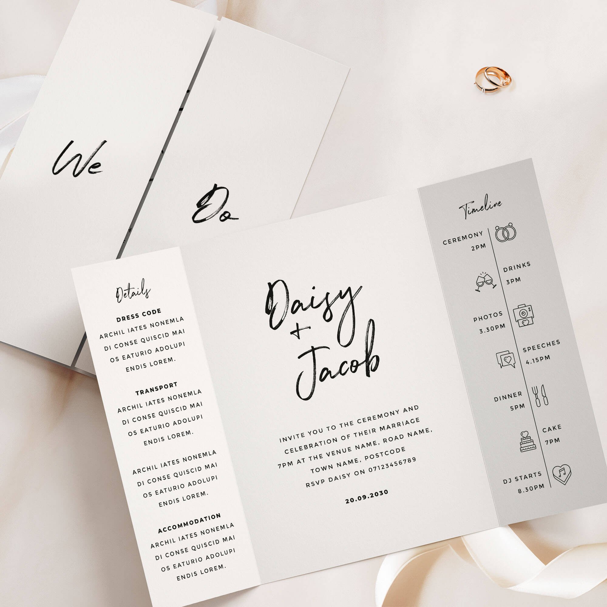
⭐️⭐️⭐️⭐️⭐️
Read what 1000s of happy couples say about us →
The Signature Collection gatefold invitation is a bold and modern design featuring expressive brush-style calligraphy in classic black and white. With a handwritten marker-pen look, this layout offers a relaxed yet confident feel that suits a wide variety of wedding styles — from contemporary city celebrations to laid-back destination days. Its simplicity and adaptability make it a timeless choice for modern couples. Designed and handled personally by Harry & Ami – every order is managed with care until you’re fully happy.
What’s Included?
– Gatefold Wedding Invitations in your chosen design, printed on 300gsm off-white tactile paper.
– Plain white envelopes are included free of charge. Prefer colour envelopes? Browse colour envelope options.
– Full design service included. We create your design for you and send digital proofs, with revisions until you’re happy.
– Free standard UK delivery for a limited time.
How to Order
– Simply select the quantity of Gatefold Wedding Invitations you need and complete your purchase. You’re in safe hands.
– Once your order is placed, we’ll personally email you within 1 business day to request your wording (we’ll also include a helpful example of how to send it).
– We’ll take care of the full design for you and send a digital proof (PDF) within one business day. Need any changes? No problem at all – we’re happy to tweak it until you’re completely happy. Nothing is printed until you give us the final go-ahead.
– It’s just the two of us here – myself (Harry) and my wife (Ami) – and we personally handle every order with care. We’re here to make it easy and stress-free for you.
Please note: If you need separate Day and Evening Wedding Invitations (with different wording), please add them to your basket as separate items. For example, add 20 Day and 30 Evening cards individually, rather than one combined quantity of 50.
What Can I Customise?
– Want to change the wording on the front of the gatefold (e.g., “We Do”)? No problem! You can personalise it with your names, initials, or other wording you’d prefer.
– Prefer extra wording instead of the timeline section? We can swap it out for wording more meaningful to you.
– The text on the details panel is completely customisable – feel free to change it to suit your needs and all the wording on the middle panel can be tailored to better reflect your information.
– Choose from over 50 different wedding related icons to fully personalise your Order of the Day Timeline.
– Need more space for wording? We offer text-only printing on the back at no extra cost.
– QR codes can be added (please note: we can’t change the colour of the QR code and can only use the file you provide).
– Colour changes may be possible on some designs. Generally, text-only designs can be colour-edited, while illustrated ones cannot, but feel free to message us to check.
Guest Name Printing
Normally, your invitation might read something like "Sarah and James invite you to the ceremony and celebration of their marriage", but with guest name printing, we replace that with your guest's actual name, so it reads "Sarah and James invite Emily and Tom to the ceremony and celebration of their marriage" instead — personalised for exactly who's being invited. If more than one person is invited on the same card (a couple, a family, or a group of friends) we can include all of their names together, and this still counts as just one guest name for pricing, however many you list — we'll always make sure everything fits neatly on a single line, so it looks beautiful every time.
Want some invitations with names and some without? For example, if you've ordered 50 invitations but only have 45 names ready, simply select guest name printing from the dropdown as normal — we'll use your full list, and any spares will be left with a gap for you to handwrite a name yourself. Handy for any last-minute additions to your guest list.
Add Matching RSVP Cards
An RSVP card is how your guests let you know whether they can attend (“RSVP" simply means "please reply.”) Your guests fill in the card to confirm they're coming (and often note things like dietary requirements), then post it back to you using the free envelope provided, so you know your final numbers in good time for your venue and caterer.
Complete your suite with RSVP cards printed in the same design as your invitations, so your whole first impression feels considered and coordinated. Each is an A7 card supplied with a free envelope, ready for your guests to reply by post.
Dimensions
– A6 size (105mm x 148mm) once folded, A5 size when flat (148mm x 210mm).
– Prefer a larger size? You can also order this design in A5 (once folded), click here for pricing and details.
Paper Type & Sustainability
Your Gatefold Wedding Invitations are digitally printed on 300gsm luxury off-white, tactile paper. Each order includes plain white envelopes free of charge.
Please note: any silver or gold elements are printed digitally (not foil).
Wedding Invitation paper details:
– Elemental Chlorine Free
– FSC® Mix Certified
– Acid Free
– Free from Heavy Metals
– Long Life
– Contains Selected Secondary Fibres
Are Samples Available?
Yes, we offer non-personalised samples for many of our designs. Browse our wedding stationery samples to see the quality before you order.
Matching Stationery
View the full Signature Collection for matching wedding stationery in this design, or browse all Gatefold Wedding Invitations to explore more styles.
Turnaround Times
– Once we receive your order, we’ll message you for your wording. After we have it, you’ll receive a digital proof within 1 business day (often same day, depending on timing).
– If your order includes a bespoke venue illustration, please allow up to 2 additional days for your proof.
– Need changes? Each round of amends takes 1 business day. On average, allow around a week for the full design process, depending on how quickly we receive your feedback.
– Once you approve your design, printing usually takes 1–2 business days, and delivery 1–3 business days. We recommend allowing up to 2 weeks total to cover any unexpected courier delays.
– Need it sooner? We offer faster tracked delivery, please get in touch for pricing and availability.
Important Details
– If you have any concerns at all, please don’t hesitate to reach out – we genuinely want you to love your stationery. In the rare event of courier damage or a lost parcel, we’ll always ensure your items are reprinted and resent, so you can feel confident you’ll receive exactly what you’ve paid for.
– Full refunds cannot be offered once a digital file or physical item has been sent, as every item is personalised.
– Colours may appear different in print than on screen because printing and digital displays use different colour processes and values.
– Colours may vary between samples, orders, and batches – similar to wallpaper printing, which requires single-batch orders for consistency.
– All images, designs, and product descriptions on our website are protected by copyright. They may not be edited, copied, recreated, or used for personal or commercial purposes without permission. This includes reproducing wording or designs.
– Sharing our products on social media is allowed only if you tag us clearly. We monitor for infringement closely. Unauthorised copying or use of our designs or descriptions will be met with legal action. H&A.
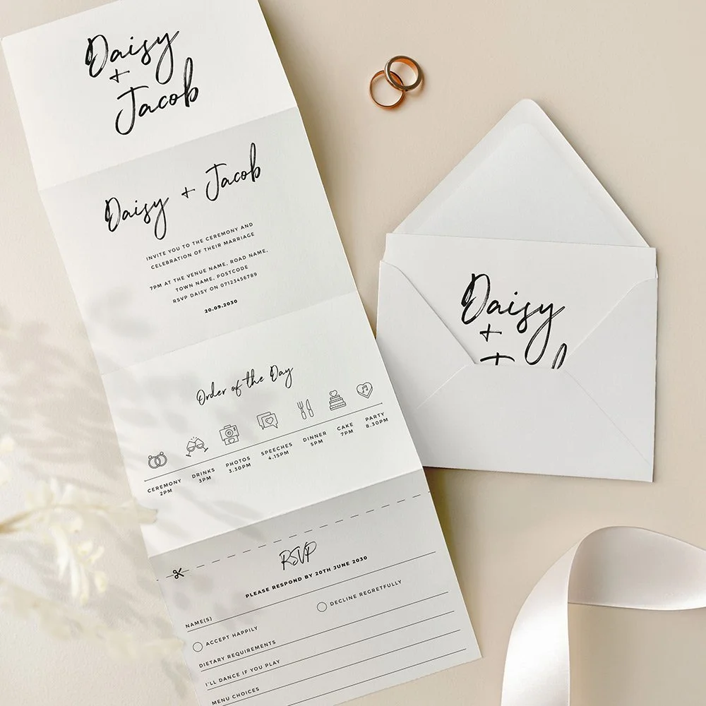
⭐️⭐️⭐️⭐️⭐️
Read what 1000s of happy couples say about us →
The Signature Collection concertina invitation is a sleek and contemporary choice, showcasing a striking black brushstroke font against a clean white background. This bold, minimal design is all about making a confident impression – ideal for modern weddings with a monochrome or city-chic aesthetic. With its built-in RSVP card and folded format, this all-in-one layout combines style and simplicity in one elegant package. Designed and handled personally by Harry & Ami – every order is managed with care until you’re fully happy.
What’s Included?
– Concertina Wedding Invitations in your chosen design, printed on 300gsm off-white tactile paper. Each invitation includes a tear-off RSVP card as part of the design. If you'd prefer guests to RSVP via QR code or email, we can replace the tear-off panel with a text-only version instead.
– C6 plain white envelopes are included free of charge. Prefer colour envelopes? Browse colour envelope options.
– Full design service included. We create your design for you and send digital proofs, with revisions until you’re happy.
– Free standard UK delivery for a limited time.
How to Order
– Simply select the quantity of Concertina Wedding Invitations you need and complete your purchase. You’re in safe hands.
– Once your order is placed, we’ll personally email you within 1 business day to request your wording (we’ll also include a helpful example of how to send it).
– We’ll take care of the full design for you and send a digital proof (PDF) within one business day. Need any changes? No problem at all – we’re happy to tweak it until you’re completely happy. Nothing is printed until you give us the final go-ahead.
– It’s just the two of us here – myself (Harry) and my wife (Ami) – and we personally handle every order with care. We’re here to make it easy and stress-free for you.
Please note: If you need separate Day and Evening Wedding Invitations (with different wording), please add them to your basket as separate items. For example, add 20 Day and 30 Evening cards individually, rather than one combined quantity of 50.
What Can I Customise?
– If you’d prefer more space for wording, we can swap the timeline panel for additional text, or even replace the RSVP panel if it’s not needed.
– If you’ve selected double-sided printing, the details panel wording is fully customisable – use any text you prefer.
– Choose from over 50 different wedding related icons to fully personalise your Order of the Day Timeline.
– All text on the main invitation panel is editable to perfectly match your wedding wording preferences.
– QR codes can be added (please note: we can’t change the colour of the QR code and can only use the file you provide).
– Colour changes may be possible on some designs. Generally, text-only designs can be colour-edited, while illustrated ones cannot, but feel free to message us to check.
Guest Name Printing
Normally, your invitation might read something like "Sarah and James invite you to the ceremony and celebration of their marriage", but with guest name printing, we replace that with your guest's actual name, so it reads "Sarah and James invite Emily and Tom to the ceremony and celebration of their marriage" instead — personalised for exactly who's being invited. If more than one person is invited on the same card (a couple, a family, or a group of friends) we can include all of their names together, and this still counts as just one guest name for pricing, however many you list — we'll always make sure everything fits neatly on a single line, so it looks beautiful every time.
Want some invitations with names and some without? For example, if you've ordered 50 invitations but only have 45 names ready, simply select guest name printing from the dropdown as normal — we'll use your full list, and any spares will be left with a gap for you to handwrite a name yourself. Handy for any last-minute additions to your guest list.
Dimensions
– A6 once folded (105mm x 148mm), 420mm x 148mm when flat.
What are the 8 panels if I select double sided?
1. Cover panel – Typically features your names or initials.
2. Invitation panel – Includes the venue name, date, time, and other key details.
3. Timeline panel – Showcases your order of the day with icons (choose from 50 available).
4. RSVP panel – For guest responses.
5. Details panel 1 – Ideal for your gift wish, wedding website, or a QR code.
6. Details panel 2 – Can include dress code, travel directions, or accommodation info.
7. Details panel 3 – Often used for a menu or dietary notes.
8. Reverse of the RSVP panel – Typically features your return address.
Prefer fewer panels or want to customise? No problem! We can leave panels blank or swap them – for example, replacing the timeline with extra wording or other content.
What are the 4 panels if I select single sided?
1. Cover panel – Typically features your names or initials.
2. Invitation panel – Includes your venue name, date, time, and key details.
3. Timeline panel – Displays your order of the day using icons (we have 50 to choose from). This can be swapped for a details panel if preferred.
4. RSVP panel – Adapted into a single-sided postcard format for the single-sided option.
Want to make changes? We can leave panels blank or customise the layout—such as removing the timeline to include additional wording or other information.
RSVP Panel
Your guests can easily tear off the RSVP panel along the perforated edge, which will already have your return address printed. If you’ve selected double-sided printing, the address will appear on the reverse; for single-sided, it will be printed on the front. The RSVP includes customisable sections for names, accept/decline options, dietary requirements, song choices, and more – tailored to suit your needs. If you would like a bespoke menu choice RSVP panel please get in touch for pricing.
Paper Type & Sustainability
Your Concertina Wedding Invitations are digitally printed on 300gsm luxury off-white, tactile paper. Each order includes plain white envelopes free of charge.
Please note: any silver or gold elements are printed digitally (not foil).
Wedding Invitation paper details:
– Elemental Chlorine Free
– FSC® Mix Certified
– Acid Free
– Free from Heavy Metals
– Long Life
– Contains Selected Secondary Fibres
Are Samples Available?
Yes, we offer non-personalised samples for many of our designs. Browse our wedding stationery samples to see the quality before you order.
Matching Stationery
View the full Signature Collection for matching wedding stationery in this design, or browse all Concertina Wedding Invitations to explore more styles.
Turnaround Times
– Once we receive your order, we’ll message you for your wording. After we have it, you’ll receive a digital proof within 1 business day (often same day, depending on timing).
– If your order includes a bespoke venue illustration, please allow up to 2 additional days for your proof.
– Need changes? Each round of amends takes 1 business day. On average, allow around a week for the full design process, depending on how quickly we receive your feedback.
– Once you approve your design, printing usually takes 1–2 business days, and delivery 1–3 business days. We recommend allowing up to 2 weeks total to cover any unexpected courier delays.
– Need it sooner? We offer faster tracked delivery, please get in touch for pricing and availability.
Important Details
– If you have any concerns at all, please don’t hesitate to reach out – we genuinely want you to love your stationery. In the rare event of courier damage or a lost parcel, we’ll always ensure your items are reprinted and resent, so you can feel confident you’ll receive exactly what you’ve paid for.
– Full refunds cannot be offered once a digital file or physical item has been sent, as every item is personalised.
– Colours may appear different in print than on screen because printing and digital displays use different colour processes and values.
– Colours may vary between samples, orders, and batches – similar to wallpaper printing, which requires single-batch orders for consistency.
– All images, designs, and product descriptions on our website are protected by copyright. They may not be edited, copied, recreated, or used for personal or commercial purposes without permission. This includes reproducing wording or designs.
– Sharing our products on social media is allowed only if you tag us clearly. We monitor for infringement closely. Unauthorised copying or use of our designs or descriptions will be met with legal action. H&A.
Autograph Wedding Invitations
Hand-lettered autograph style. View the complete Autograph wedding stationery collection →

⭐️⭐️⭐️⭐️⭐️
Read what 1000s of happy couples say about us →
Modern and full of personality, our Autograph wedding invitations combine a clean black and white layout with a bold, playful script font. This design brings a relaxed, expressive tone to your wedding stationery – perfect for couples looking for a minimalist invitation that still feels fun, creative, and full of charm. A distinctive addition to our typography and monochrome collections. Designed and handled personally by Harry & Ami – every order is managed with care until you’re fully happy.
What’s Included?
– Wedding Invitations in your chosen design, printed on 300gsm off-white tactile paper.
– Plain white envelopes are included free of charge. Prefer colour envelopes? Browse colour envelope options.
– Full design service included. We create your design for you and send digital proofs, with revisions until you’re happy.
– Free standard UK delivery for a limited time.
How to Order
– Simply select the quantity of Wedding Invitations you need and complete your purchase. You’re in safe hands.
– Once your order is placed, we’ll personally email you within 1 business day to request your wording (we’ll also include a helpful example of how to send it). If you already have it ready, feel free to add it at checkout in the personalisation box.
– We’ll take care of the full design for you and send a digital proof (PDF) within one business day. Need any changes? No problem at all – we’re happy to tweak it until you’re completely happy. Nothing is printed until you give us the final go-ahead.
– It’s just the two of us here – myself (Harry) and my wife (Ami) – and we personally handle every order with care. We’re here to make it easy and stress-free for you.
Please note: If you need separate Day and Evening Wedding Invitations (with different wording), please add them to your basket as separate items. For example, add 20 Day and 30 Evening cards individually, rather than one combined quantity of 50.
What Can I Customise?
– All wording can be changed to suit your wedding details.
– Need more space for wording? A small amount of additional wording can be printed on the reverse of the invitation, included in the price. This space is designed for a short overflow note, such as a brief RSVP line or a small message about gifts. As part of the invitation design, we include a centred text box that fits up to 150 characters (approximately two short sentences). This layout is fixed so the wording remains balanced with the design. If you need to include more detailed guest information (accommodation, travel, timings etc.), we recommend adding one of our matching information cards, which can be ordered by clicking here.
– QR codes can be added (please note: we can’t change the colour of the QR code and can only use the file you provide).
– Colour changes may be possible on some designs. Generally, text-only designs can be colour-edited, while illustrated ones cannot, but feel free to message us to check.
Guest Name Printing
Normally, your invitation might read something like "Sarah and James invite you to the ceremony and celebration of their marriage", but with guest name printing, we replace that with your guest's actual name, so it reads "Sarah and James invite Emily and Tom to the ceremony and celebration of their marriage" instead — personalised for exactly who's being invited. If more than one person is invited on the same card (a couple, a family, or a group of friends) we can include all of their names together, and this still counts as just one guest name for pricing, however many you list — we'll always make sure everything fits neatly on a single line, so it looks beautiful every time.
Want some invitations with names and some without? For example, if you've ordered 50 invitations but only have 45 names ready, simply select guest name printing from the dropdown as normal — we'll use your full list, and any spares will be left with a gap for you to handwrite a name yourself. Handy for any last-minute additions to your guest list.
Add Matching RSVP Cards
An RSVP card is how your guests let you know whether they can attend (“RSVP" simply means "please reply.”) Your guests fill in the card to confirm they're coming (and often note things like dietary requirements), then post it back to you using the free envelope provided, so you know your final numbers in good time for your venue and caterer.
Complete your suite with RSVP cards printed in the same design as your invitations, so your whole first impression feels considered and coordinated. Each is an A7 card supplied with a free envelope, ready for your guests to reply by post.
Dimensions
– A6 size (105mm x 148mm).
– Prefer a larger size? You can also order this design in A5, click here for pricing and details.
Paper Type & Sustainability
Your Wedding Invitations are digitally printed on 300gsm luxury off-white, tactile paper. Each order includes plain white envelopes free of charge.
Please note: any silver or gold elements are printed digitally (not foil).
Wedding Invitation paper details:
– Elemental Chlorine Free
– FSC® Mix Certified
– Acid Free
– Free from Heavy Metals
– Long Life
– Contains Selected Secondary Fibres
Are Samples Available?
Yes, we offer non-personalised samples for many of our designs. Browse our wedding stationery samples to see the quality before you order.
Matching Stationery
View the full Autograph Collection for matching wedding stationery in this design, or browse all Wedding Invitations to explore more styles.
Turnaround Times
– Once we receive your order, we’ll message you for your wording. After we have it, you’ll receive a digital proof within 1 business day (often same day, depending on timing).
– If your order includes a bespoke venue illustration, please allow up to 2 additional days for your proof.
– Need changes? Each round of amends takes 1 business day. On average, allow around a week for the full design process, depending on how quickly we receive your feedback.
– Once you approve your design, printing usually takes 1–2 business days, and delivery 1–3 business days. We recommend allowing up to 2 weeks total to cover any unexpected courier delays.
– Need it sooner? We offer faster tracked delivery, please get in touch for pricing and availability.
Important Details
– If you have any concerns at all, please don’t hesitate to reach out – we genuinely want you to love your stationery. In the rare event of courier damage or a lost parcel, we’ll always ensure your items are reprinted and resent, so you can feel confident you’ll receive exactly what you’ve paid for.
– Full refunds cannot be offered once a digital file or physical item has been sent, as every item is personalised.
– Colours may appear different in print than on screen because printing and digital displays use different colour processes and values.
– Colours may vary between samples, orders, and batches – similar to wallpaper printing, which requires single-batch orders for consistency.
– All images, designs, and product descriptions on our website are protected by copyright. They may not be edited, copied, recreated, or used for personal or commercial purposes without permission. This includes reproducing wording or designs.
– Sharing our products on social media is allowed only if you tag us clearly. We monitor for infringement closely. Unauthorised copying or use of our designs or descriptions will be met with legal action. H&A.
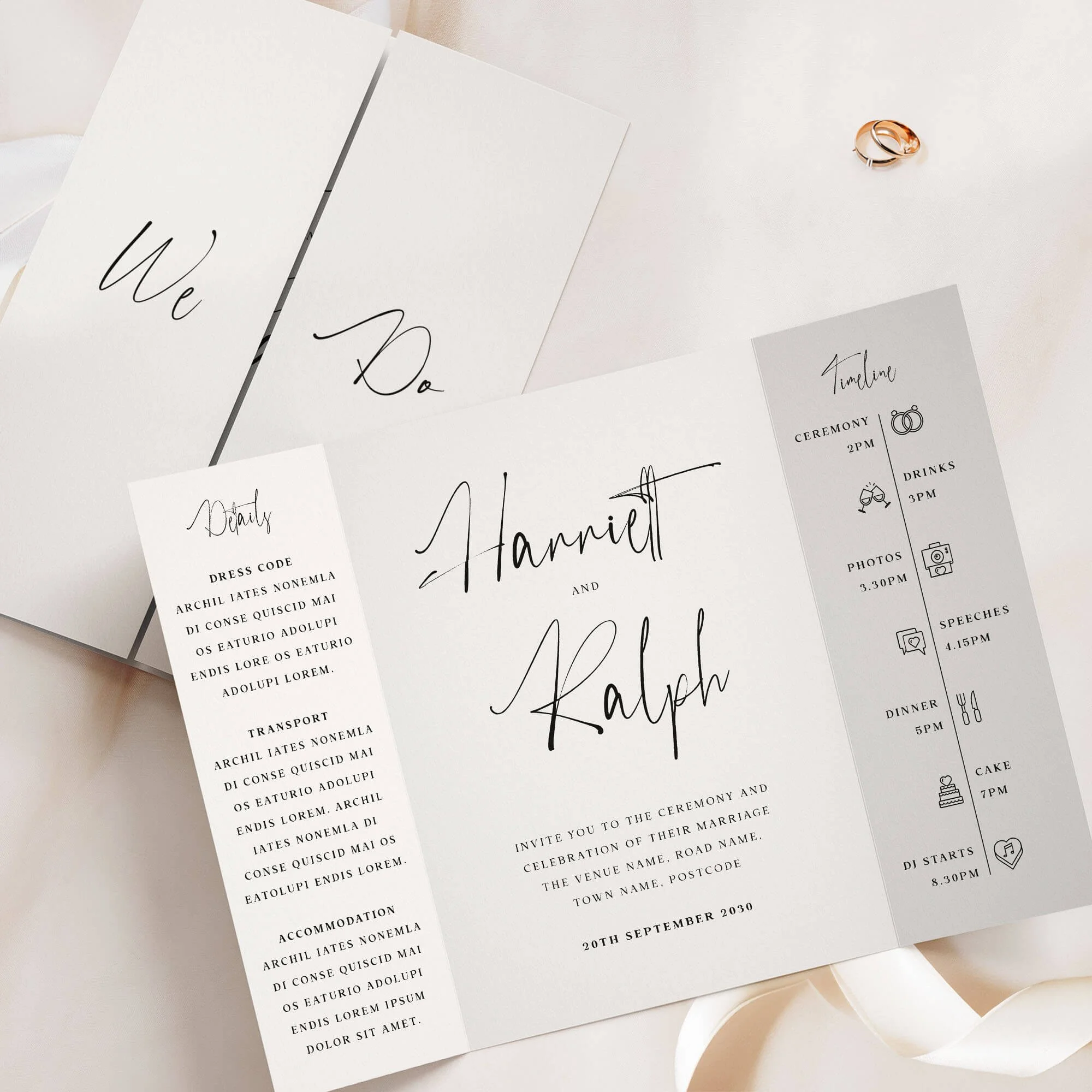
⭐️⭐️⭐️⭐️⭐️
Read what 1000s of happy couples say about us →
The Autograph Collection gatefold invitation features sleek, modern typography with bold black calligraphy-inspired text on a clean white background. Its minimalist design exudes contemporary elegance, making it perfect for couples seeking a stylish and sophisticated wedding stationery suite. Designed and handled personally by Harry & Ami – every order is managed with care until you’re fully happy.
What’s Included?
– Gatefold Wedding Invitations in your chosen design, printed on 300gsm off-white tactile paper.
– Plain white envelopes are included free of charge. Prefer colour envelopes? Browse colour envelope options.
– Full design service included. We create your design for you and send digital proofs, with revisions until you’re happy.
– Free standard UK delivery for a limited time.
How to Order
– Simply select the quantity of Gatefold Wedding Invitations you need and complete your purchase. You’re in safe hands.
– Once your order is placed, we’ll personally email you within 1 business day to request your wording (we’ll also include a helpful example of how to send it).
– We’ll take care of the full design for you and send a digital proof (PDF) within one business day. Need any changes? No problem at all – we’re happy to tweak it until you’re completely happy. Nothing is printed until you give us the final go-ahead.
– It’s just the two of us here – myself (Harry) and my wife (Ami) – and we personally handle every order with care. We’re here to make it easy and stress-free for you.
Please note: If you need separate Day and Evening Wedding Invitations (with different wording), please add them to your basket as separate items. For example, add 20 Day and 30 Evening cards individually, rather than one combined quantity of 50.
What Can I Customise?
– Want to change the wording on the front of the gatefold (e.g., “We Do”)? No problem! You can personalise it with your names, initials, or other wording you’d prefer.
– Prefer extra wording instead of the timeline section? We can swap it out for wording more meaningful to you.
– The text on the details panel is completely customisable – feel free to change it to suit your needs and all the wording on the middle panel can be tailored to better reflect your information.
– Choose from over 50 different wedding related icons to fully personalise your Order of the Day Timeline.
– Need more space for wording? We offer text-only printing on the back at no extra cost.
– QR codes can be added (please note: we can’t change the colour of the QR code and can only use the file you provide).
– Colour changes may be possible on some designs. Generally, text-only designs can be colour-edited, while illustrated ones cannot, but feel free to message us to check.
Guest Name Printing
Normally, your invitation might read something like "Sarah and James invite you to the ceremony and celebration of their marriage", but with guest name printing, we replace that with your guest's actual name, so it reads "Sarah and James invite Emily and Tom to the ceremony and celebration of their marriage" instead — personalised for exactly who's being invited. If more than one person is invited on the same card (a couple, a family, or a group of friends) we can include all of their names together, and this still counts as just one guest name for pricing, however many you list — we'll always make sure everything fits neatly on a single line, so it looks beautiful every time.
Want some invitations with names and some without? For example, if you've ordered 50 invitations but only have 45 names ready, simply select guest name printing from the dropdown as normal — we'll use your full list, and any spares will be left with a gap for you to handwrite a name yourself. Handy for any last-minute additions to your guest list.
Add Matching RSVP Cards
An RSVP card is how your guests let you know whether they can attend (“RSVP" simply means "please reply.”) Your guests fill in the card to confirm they're coming (and often note things like dietary requirements), then post it back to you using the free envelope provided, so you know your final numbers in good time for your venue and caterer.
Complete your suite with RSVP cards printed in the same design as your invitations, so your whole first impression feels considered and coordinated. Each is an A7 card supplied with a free envelope, ready for your guests to reply by post.
Dimensions
– A6 size (105mm x 148mm) once folded, A5 size when flat (148mm x 210mm).
– Prefer a larger size? You can also order this design in A5 (once folded), click here for pricing and details.
Paper Type & Sustainability
Your Gatefold Wedding Invitations are digitally printed on 300gsm luxury off-white, tactile paper. Each order includes plain white envelopes free of charge.
Please note: any silver or gold elements are printed digitally (not foil).
Wedding Invitation paper details:
– Elemental Chlorine Free
– FSC® Mix Certified
– Acid Free
– Free from Heavy Metals
– Long Life
– Contains Selected Secondary Fibres
Are Samples Available?
Yes, we offer non-personalised samples for many of our designs. Browse our wedding stationery samples to see the quality before you order.
Matching Stationery
View the full Autograph Collection for matching wedding stationery in this design, or browse all Gatefold Wedding Invitations to explore more styles.
Turnaround Times
– Once we receive your order, we’ll message you for your wording. After we have it, you’ll receive a digital proof within 1 business day (often same day, depending on timing).
– If your order includes a bespoke venue illustration, please allow up to 2 additional days for your proof.
– Need changes? Each round of amends takes 1 business day. On average, allow around a week for the full design process, depending on how quickly we receive your feedback.
– Once you approve your design, printing usually takes 1–2 business days, and delivery 1–3 business days. We recommend allowing up to 2 weeks total to cover any unexpected courier delays.
– Need it sooner? We offer faster tracked delivery, please get in touch for pricing and availability.
Important Details
– If you have any concerns at all, please don’t hesitate to reach out – we genuinely want you to love your stationery. In the rare event of courier damage or a lost parcel, we’ll always ensure your items are reprinted and resent, so you can feel confident you’ll receive exactly what you’ve paid for.
– Full refunds cannot be offered once a digital file or physical item has been sent, as every item is personalised.
– Colours may appear different in print than on screen because printing and digital displays use different colour processes and values.
– Colours may vary between samples, orders, and batches – similar to wallpaper printing, which requires single-batch orders for consistency.
– All images, designs, and product descriptions on our website are protected by copyright. They may not be edited, copied, recreated, or used for personal or commercial purposes without permission. This includes reproducing wording or designs.
– Sharing our products on social media is allowed only if you tag us clearly. We monitor for infringement closely. Unauthorised copying or use of our designs or descriptions will be met with legal action. H&A.
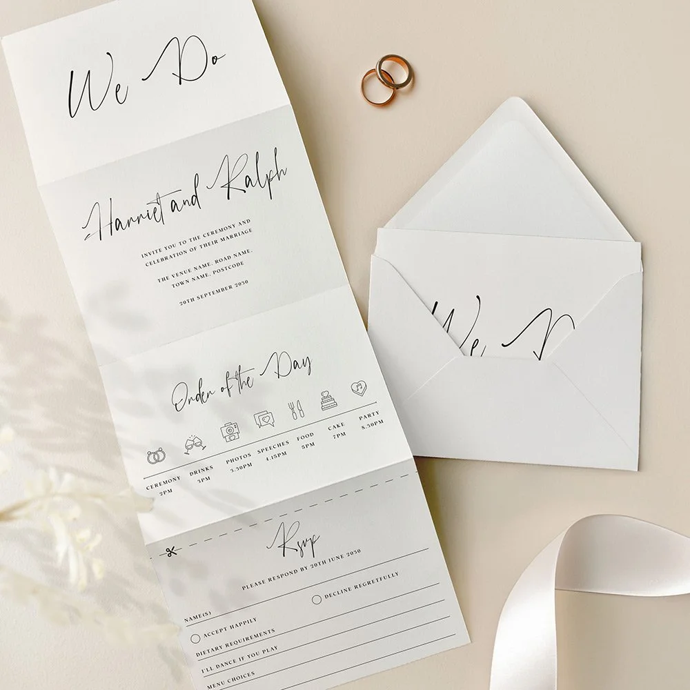
⭐️⭐️⭐️⭐️⭐️
Read what 1000s of happy couples say about us →
The Autograph Collection concertina wedding invitation is defined by its fluid, contemporary script and clean layout. This design combines flowing, calligraphy-style lettering with understated elegance, creating a refined yet relaxed tone. The all-in-one fold-out format, complete with a tear-off RSVP panel, makes it a practical and beautifully cohesive choice for modern weddings with a personal touch. Designed and handled personally by Harry & Ami – every order is managed with care until you’re fully happy.
What’s Included?
– Concertina Wedding Invitations in your chosen design, printed on 300gsm off-white tactile paper. Each invitation includes a tear-off RSVP card as part of the design. If you'd prefer guests to RSVP via QR code or email, we can replace the tear-off panel with a text-only version instead.
– C6 plain white envelopes are included free of charge. Prefer colour envelopes? Browse colour envelope options.
– Full design service included. We create your design for you and send digital proofs, with revisions until you’re happy.
– Free standard UK delivery for a limited time.
How to Order
– Simply select the quantity of Concertina Wedding Invitations you need and complete your purchase. You’re in safe hands.
– Once your order is placed, we’ll personally email you within 1 business day to request your wording (we’ll also include a helpful example of how to send it).
– We’ll take care of the full design for you and send a digital proof (PDF) within one business day. Need any changes? No problem at all – we’re happy to tweak it until you’re completely happy. Nothing is printed until you give us the final go-ahead.
– It’s just the two of us here – myself (Harry) and my wife (Ami) – and we personally handle every order with care. We’re here to make it easy and stress-free for you.
Please note: If you need separate Day and Evening Wedding Invitations (with different wording), please add them to your basket as separate items. For example, add 20 Day and 30 Evening cards individually, rather than one combined quantity of 50.
What Can I Customise?
– If you’d prefer more space for wording, we can swap the timeline panel for additional text, or even replace the RSVP panel if it’s not needed.
– If you’ve selected double-sided printing, the details panel wording is fully customisable – use any text you prefer.
– Choose from over 50 different wedding related icons to fully personalise your Order of the Day Timeline.
– All text on the main invitation panel is editable to perfectly match your wedding wording preferences.
– QR codes can be added (please note: we can’t change the colour of the QR code and can only use the file you provide).
– Colour changes may be possible on some designs. Generally, text-only designs can be colour-edited, while illustrated ones cannot, but feel free to message us to check.
Guest Name Printing
Normally, your invitation might read something like "Sarah and James invite you to the ceremony and celebration of their marriage", but with guest name printing, we replace that with your guest's actual name, so it reads "Sarah and James invite Emily and Tom to the ceremony and celebration of their marriage" instead — personalised for exactly who's being invited. If more than one person is invited on the same card (a couple, a family, or a group of friends) we can include all of their names together, and this still counts as just one guest name for pricing, however many you list — we'll always make sure everything fits neatly on a single line, so it looks beautiful every time.
Want some invitations with names and some without? For example, if you've ordered 50 invitations but only have 45 names ready, simply select guest name printing from the dropdown as normal — we'll use your full list, and any spares will be left with a gap for you to handwrite a name yourself. Handy for any last-minute additions to your guest list.
Dimensions
– A6 once folded (105mm x 148mm), 420mm x 148mm when flat.
What are the 8 panels if I select double sided?
1. Cover panel – Typically features your names or initials.
2. Invitation panel – Includes the venue name, date, time, and other key details.
3. Timeline panel – Showcases your order of the day with icons (choose from 50 available).
4. RSVP panel – For guest responses.
5. Details panel 1 – Ideal for your gift wish, wedding website, or a QR code.
6. Details panel 2 – Can include dress code, travel directions, or accommodation info.
7. Details panel 3 – Often used for a menu or dietary notes.
8. Reverse of the RSVP panel – Typically features your return address.
Prefer fewer panels or want to customise? No problem! We can leave panels blank or swap them – for example, replacing the timeline with extra wording or other content.
What are the 4 panels if I select single sided?
1. Cover panel – Typically features your names or initials.
2. Invitation panel – Includes your venue name, date, time, and key details.
3. Timeline panel – Displays your order of the day using icons (we have 50 to choose from). This can be swapped for a details panel if preferred.
4. RSVP panel – Adapted into a single-sided postcard format for the single-sided option.
Want to make changes? We can leave panels blank or customise the layout—such as removing the timeline to include additional wording or other information.
RSVP Panel
Your guests can easily tear off the RSVP panel along the perforated edge, which will already have your return address printed. If you’ve selected double-sided printing, the address will appear on the reverse; for single-sided, it will be printed on the front. The RSVP includes customisable sections for names, accept/decline options, dietary requirements, song choices, and more – tailored to suit your needs. If you would like a bespoke menu choice RSVP panel please get in touch for pricing.
Paper Type & Sustainability
Your Concertina Wedding Invitations are digitally printed on 300gsm luxury off-white, tactile paper. Each order includes plain white envelopes free of charge.
Please note: any silver or gold elements are printed digitally (not foil).
Wedding Invitation paper details:
– Elemental Chlorine Free
– FSC® Mix Certified
– Acid Free
– Free from Heavy Metals
– Long Life
– Contains Selected Secondary Fibres
Are Samples Available?
Yes, we offer non-personalised samples for many of our designs. Browse our wedding stationery samples to see the quality before you order.
Matching Stationery
View the full Autograph Collection for matching wedding stationery in this design, or browse all Concertina Wedding Invitations to explore more styles.
Turnaround Times
– Once we receive your order, we’ll message you for your wording. After we have it, you’ll receive a digital proof within 1 business day (often same day, depending on timing).
– If your order includes a bespoke venue illustration, please allow up to 2 additional days for your proof.
– Need changes? Each round of amends takes 1 business day. On average, allow around a week for the full design process, depending on how quickly we receive your feedback.
– Once you approve your design, printing usually takes 1–2 business days, and delivery 1–3 business days. We recommend allowing up to 2 weeks total to cover any unexpected courier delays.
– Need it sooner? We offer faster tracked delivery, please get in touch for pricing and availability.
Important Details
– If you have any concerns at all, please don’t hesitate to reach out – we genuinely want you to love your stationery. In the rare event of courier damage or a lost parcel, we’ll always ensure your items are reprinted and resent, so you can feel confident you’ll receive exactly what you’ve paid for.
– Full refunds cannot be offered once a digital file or physical item has been sent, as every item is personalised.
– Colours may appear different in print than on screen because printing and digital displays use different colour processes and values.
– Colours may vary between samples, orders, and batches – similar to wallpaper printing, which requires single-batch orders for consistency.
– All images, designs, and product descriptions on our website are protected by copyright. They may not be edited, copied, recreated, or used for personal or commercial purposes without permission. This includes reproducing wording or designs.
– Sharing our products on social media is allowed only if you tag us clearly. We monitor for infringement closely. Unauthorised copying or use of our designs or descriptions will be met with legal action. H&A.
Minimal Wedding Invitations
A minimal, type-focused layout. View the complete Minimal wedding stationery collection →

⭐️⭐️⭐️⭐️⭐️
Read what 1000s of happy couples say about us →
Stripped back and effortlessly modern, our Minimal wedding invitations feature a sleek black and white layout with a refined, ultra-minimal typeface. A standout in our collection of contemporary and monochrome designs, this invitation is perfect for couples who love clean lines, white space, and a timeless aesthetic with a modern twist. Designed and handled personally by Harry & Ami – every order is managed with care until you’re fully happy.
What’s Included?
– Wedding Invitations in your chosen design, printed on 300gsm off-white tactile paper.
– Plain white envelopes are included free of charge. Prefer colour envelopes? Browse colour envelope options.
– Full design service included. We create your design for you and send digital proofs, with revisions until you’re happy.
– Free standard UK delivery for a limited time.
How to Order
– Simply select the quantity of Wedding Invitations you need and complete your purchase. You’re in safe hands.
– Once your order is placed, we’ll personally email you within 1 business day to request your wording (we’ll also include a helpful example of how to send it). If you already have it ready, feel free to add it at checkout in the personalisation box.
– We’ll take care of the full design for you and send a digital proof (PDF) within one business day. Need any changes? No problem at all – we’re happy to tweak it until you’re completely happy. Nothing is printed until you give us the final go-ahead.
– It’s just the two of us here – myself (Harry) and my wife (Ami) – and we personally handle every order with care. We’re here to make it easy and stress-free for you.
Please note: If you need separate Day and Evening Wedding Invitations (with different wording), please add them to your basket as separate items. For example, add 20 Day and 30 Evening cards individually, rather than one combined quantity of 50.
What Can I Customise?
– All wording can be changed to suit your wedding details.
– Need more space for wording? A small amount of additional wording can be printed on the reverse of the invitation, included in the price. This space is designed for a short overflow note, such as a brief RSVP line or a small message about gifts. As part of the invitation design, we include a centred text box that fits up to 150 characters (approximately two short sentences). This layout is fixed so the wording remains balanced with the design. If you need to include more detailed guest information (accommodation, travel, timings etc.), we recommend adding one of our matching information cards, which can be ordered by clicking here.
– QR codes can be added (please note: we can’t change the colour of the QR code and can only use the file you provide).
– Colour changes may be possible on some designs. Generally, text-only designs can be colour-edited, while illustrated ones cannot, but feel free to message us to check.
Guest Name Printing
Normally, your invitation might read something like "Sarah and James invite you to the ceremony and celebration of their marriage", but with guest name printing, we replace that with your guest's actual name, so it reads "Sarah and James invite Emily and Tom to the ceremony and celebration of their marriage" instead — personalised for exactly who's being invited. If more than one person is invited on the same card (a couple, a family, or a group of friends) we can include all of their names together, and this still counts as just one guest name for pricing, however many you list — we'll always make sure everything fits neatly on a single line, so it looks beautiful every time.
Want some invitations with names and some without? For example, if you've ordered 50 invitations but only have 45 names ready, simply select guest name printing from the dropdown as normal — we'll use your full list, and any spares will be left with a gap for you to handwrite a name yourself. Handy for any last-minute additions to your guest list.
Add Matching RSVP Cards
An RSVP card is how your guests let you know whether they can attend (“RSVP" simply means "please reply.”) Your guests fill in the card to confirm they're coming (and often note things like dietary requirements), then post it back to you using the free envelope provided, so you know your final numbers in good time for your venue and caterer.
Complete your suite with RSVP cards printed in the same design as your invitations, so your whole first impression feels considered and coordinated. Each is an A7 card supplied with a free envelope, ready for your guests to reply by post.
Dimensions
– A6 size (105mm x 148mm).
– Prefer a larger size? You can also order this design in A5, click here for pricing and details.
Paper Type & Sustainability
Your Wedding Invitations are digitally printed on 300gsm luxury off-white, tactile paper. Each order includes plain white envelopes free of charge.
Please note: any silver or gold elements are printed digitally (not foil).
Wedding Invitation paper details:
– Elemental Chlorine Free
– FSC® Mix Certified
– Acid Free
– Free from Heavy Metals
– Long Life
– Contains Selected Secondary Fibres
Are Samples Available?
Yes, we offer non-personalised samples for many of our designs. Browse our wedding stationery samples to see the quality before you order.
Matching Stationery
View the full Minimal Collection for matching wedding stationery in this design, or browse all Wedding Invitations to explore more styles.
Turnaround Times
– Once we receive your order, we’ll message you for your wording. After we have it, you’ll receive a digital proof within 1 business day (often same day, depending on timing).
– If your order includes a bespoke venue illustration, please allow up to 2 additional days for your proof.
– Need changes? Each round of amends takes 1 business day. On average, allow around a week for the full design process, depending on how quickly we receive your feedback.
– Once you approve your design, printing usually takes 1–2 business days, and delivery 1–3 business days. We recommend allowing up to 2 weeks total to cover any unexpected courier delays.
– Need it sooner? We offer faster tracked delivery, please get in touch for pricing and availability.
Important Details
– If you have any concerns at all, please don’t hesitate to reach out – we genuinely want you to love your stationery. In the rare event of courier damage or a lost parcel, we’ll always ensure your items are reprinted and resent, so you can feel confident you’ll receive exactly what you’ve paid for.
– Full refunds cannot be offered once a digital file or physical item has been sent, as every item is personalised.
– Colours may appear different in print than on screen because printing and digital displays use different colour processes and values.
– Colours may vary between samples, orders, and batches – similar to wallpaper printing, which requires single-batch orders for consistency.
– All images, designs, and product descriptions on our website are protected by copyright. They may not be edited, copied, recreated, or used for personal or commercial purposes without permission. This includes reproducing wording or designs.
– Sharing our products on social media is allowed only if you tag us clearly. We monitor for infringement closely. Unauthorised copying or use of our designs or descriptions will be met with legal action. H&A.
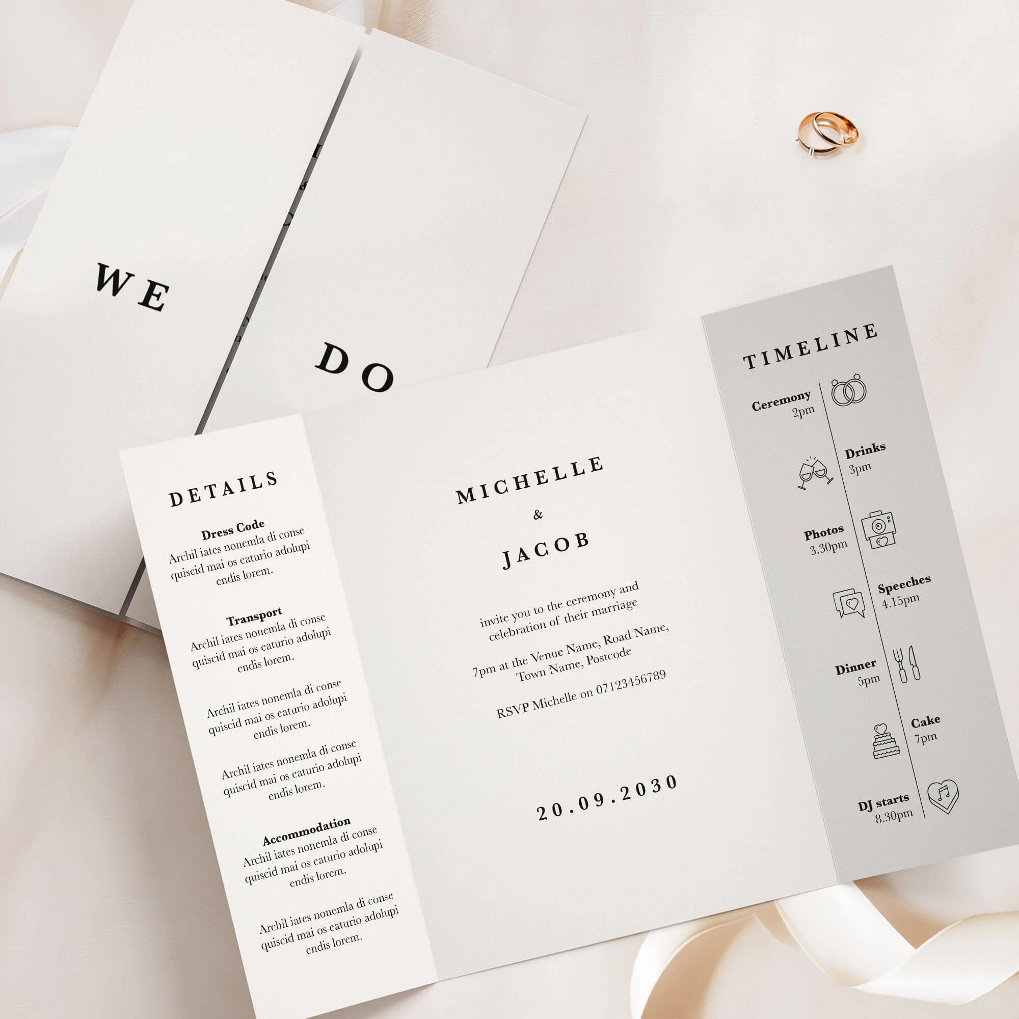
⭐️⭐️⭐️⭐️⭐️
Read what 1000s of happy couples say about us →
The Minimal Collection gatefold wedding invitation offers sleek, modern elegance with a focus on clean lines and understated design. Featuring minimalist typography and subtle detailing, this style is perfect for contemporary couples seeking timeless sophistication without excess. Designed and handled personally by Harry & Ami – every order is managed with care until you’re fully happy.
What’s Included?
– Gatefold Wedding Invitations in your chosen design, printed on 300gsm off-white tactile paper.
– Plain white envelopes are included free of charge. Prefer colour envelopes? Browse colour envelope options.
– Full design service included. We create your design for you and send digital proofs, with revisions until you’re happy.
– Free standard UK delivery for a limited time.
How to Order
– Simply select the quantity of Gatefold Wedding Invitations you need and complete your purchase. You’re in safe hands.
– Once your order is placed, we’ll personally email you within 1 business day to request your wording (we’ll also include a helpful example of how to send it).
– We’ll take care of the full design for you and send a digital proof (PDF) within one business day. Need any changes? No problem at all – we’re happy to tweak it until you’re completely happy. Nothing is printed until you give us the final go-ahead.
– It’s just the two of us here – myself (Harry) and my wife (Ami) – and we personally handle every order with care. We’re here to make it easy and stress-free for you.
Please note: If you need separate Day and Evening Wedding Invitations (with different wording), please add them to your basket as separate items. For example, add 20 Day and 30 Evening cards individually, rather than one combined quantity of 50.
What Can I Customise?
– Want to change the wording on the front of the gatefold (e.g., “We Do”)? No problem! You can personalise it with your names, initials, or other wording you’d prefer.
– Prefer extra wording instead of the timeline section? We can swap it out for wording more meaningful to you.
– The text on the details panel is completely customisable – feel free to change it to suit your needs and all the wording on the middle panel can be tailored to better reflect your information.
– Choose from over 50 different wedding related icons to fully personalise your Order of the Day Timeline.
– Need more space for wording? We offer text-only printing on the back at no extra cost.
– QR codes can be added (please note: we can’t change the colour of the QR code and can only use the file you provide).
– Colour changes may be possible on some designs. Generally, text-only designs can be colour-edited, while illustrated ones cannot, but feel free to message us to check.
Guest Name Printing
Normally, your invitation might read something like "Sarah and James invite you to the ceremony and celebration of their marriage", but with guest name printing, we replace that with your guest's actual name, so it reads "Sarah and James invite Emily and Tom to the ceremony and celebration of their marriage" instead — personalised for exactly who's being invited. If more than one person is invited on the same card (a couple, a family, or a group of friends) we can include all of their names together, and this still counts as just one guest name for pricing, however many you list — we'll always make sure everything fits neatly on a single line, so it looks beautiful every time.
Want some invitations with names and some without? For example, if you've ordered 50 invitations but only have 45 names ready, simply select guest name printing from the dropdown as normal — we'll use your full list, and any spares will be left with a gap for you to handwrite a name yourself. Handy for any last-minute additions to your guest list.
Add Matching RSVP Cards
An RSVP card is how your guests let you know whether they can attend (“RSVP" simply means "please reply.”) Your guests fill in the card to confirm they're coming (and often note things like dietary requirements), then post it back to you using the free envelope provided, so you know your final numbers in good time for your venue and caterer.
Complete your suite with RSVP cards printed in the same design as your invitations, so your whole first impression feels considered and coordinated. Each is an A7 card supplied with a free envelope, ready for your guests to reply by post.
Dimensions
– A6 size (105mm x 148mm) once folded, A5 size when flat (148mm x 210mm).
– Prefer a larger size? You can also order this design in A5 (once folded), click here for pricing and details.
Paper Type & Sustainability
Your Gatefold Wedding Invitations are digitally printed on 300gsm luxury off-white, tactile paper. Each order includes plain white envelopes free of charge.
Please note: any silver or gold elements are printed digitally (not foil).
Wedding Invitation paper details:
– Elemental Chlorine Free
– FSC® Mix Certified
– Acid Free
– Free from Heavy Metals
– Long Life
– Contains Selected Secondary Fibres
Are Samples Available?
Yes, we offer non-personalised samples for many of our designs. Browse our wedding stationery samples to see the quality before you order.
Matching Stationery
View the full Minimal Collection for matching wedding stationery in this design, or browse all Gatefold Wedding Invitations to explore more styles.
Turnaround Times
– Once we receive your order, we’ll message you for your wording. After we have it, you’ll receive a digital proof within 1 business day (often same day, depending on timing).
– If your order includes a bespoke venue illustration, please allow up to 2 additional days for your proof.
– Need changes? Each round of amends takes 1 business day. On average, allow around a week for the full design process, depending on how quickly we receive your feedback.
– Once you approve your design, printing usually takes 1–2 business days, and delivery 1–3 business days. We recommend allowing up to 2 weeks total to cover any unexpected courier delays.
– Need it sooner? We offer faster tracked delivery, please get in touch for pricing and availability.
Important Details
– If you have any concerns at all, please don’t hesitate to reach out – we genuinely want you to love your stationery. In the rare event of courier damage or a lost parcel, we’ll always ensure your items are reprinted and resent, so you can feel confident you’ll receive exactly what you’ve paid for.
– Full refunds cannot be offered once a digital file or physical item has been sent, as every item is personalised.
– Colours may appear different in print than on screen because printing and digital displays use different colour processes and values.
– Colours may vary between samples, orders, and batches – similar to wallpaper printing, which requires single-batch orders for consistency.
– All images, designs, and product descriptions on our website are protected by copyright. They may not be edited, copied, recreated, or used for personal or commercial purposes without permission. This includes reproducing wording or designs.
– Sharing our products on social media is allowed only if you tag us clearly. We monitor for infringement closely. Unauthorised copying or use of our designs or descriptions will be met with legal action. H&A.
Classic Wedding Invitations
Timeless typographic styling. View the complete Classic wedding stationery collection →
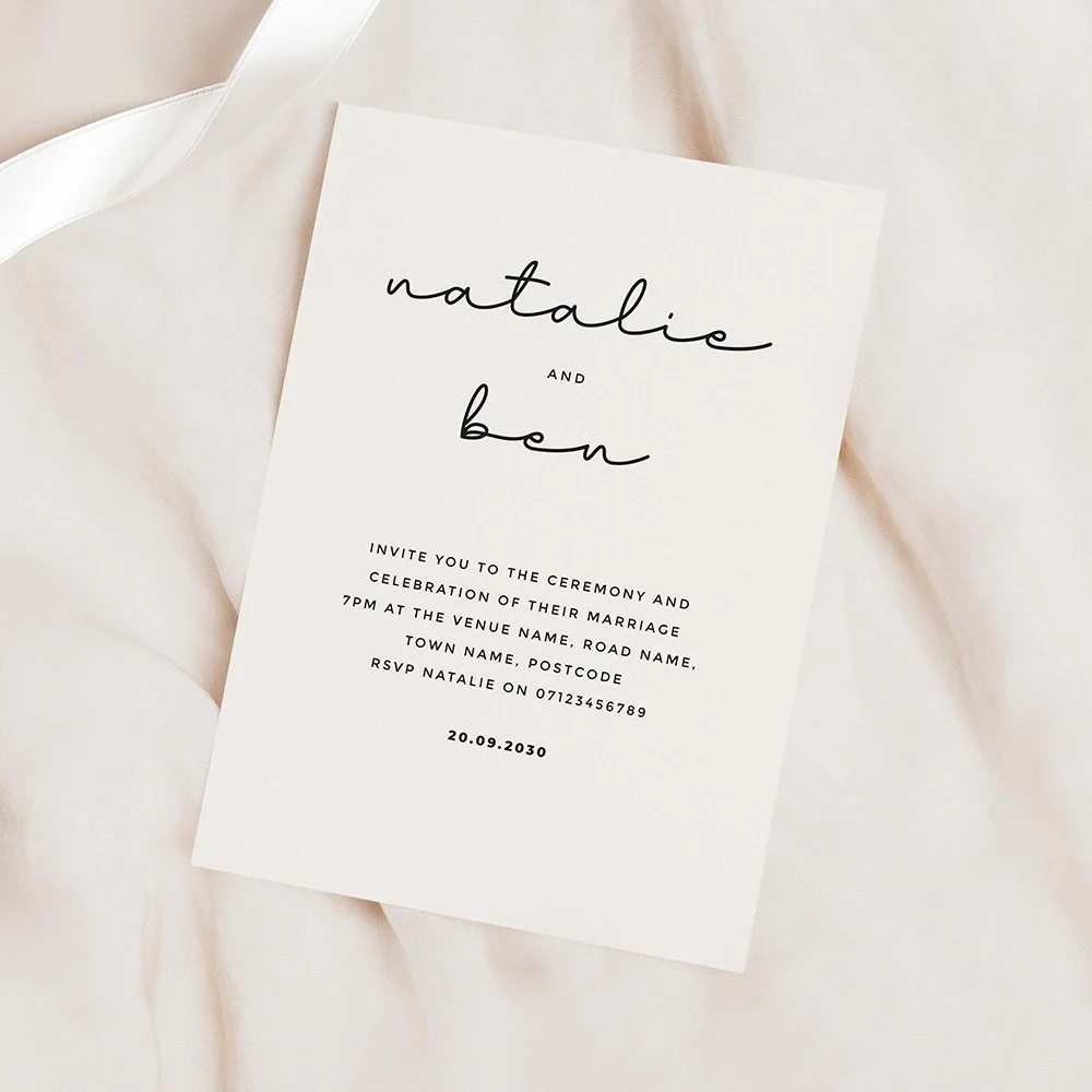
⭐️⭐️⭐️⭐️⭐️
Read what 1000s of happy couples say about us →
Sleek, modern, and effortlessly stylish – our Classic Collection wedding stationery is all about refined simplicity. Featuring a monochrome black and white palette with a mix of clean sans serif type and elegant handwritten calligraphy, this design is perfect for couples who love minimalist aesthetics. Ideal for city weddings, modern venues, or chic black-tie celebrations. Designed and handled personally by Harry & Ami – every order is managed with care until you’re fully happy.
What’s Included?
– Wedding Invitations in your chosen design, printed on 300gsm off-white tactile paper.
– Plain white envelopes are included free of charge. Prefer colour envelopes? Browse colour envelope options.
– Full design service included. We create your design for you and send digital proofs, with revisions until you’re happy.
– Free standard UK delivery for a limited time.
How to Order
– Simply select the quantity of Wedding Invitations you need and complete your purchase. You’re in safe hands.
– Once your order is placed, we’ll personally email you within 1 business day to request your wording (we’ll also include a helpful example of how to send it). If you already have it ready, feel free to add it at checkout in the personalisation box.
– We’ll take care of the full design for you and send a digital proof (PDF) within one business day. Need any changes? No problem at all – we’re happy to tweak it until you’re completely happy. Nothing is printed until you give us the final go-ahead.
– It’s just the two of us here – myself (Harry) and my wife (Ami) – and we personally handle every order with care. We’re here to make it easy and stress-free for you.
Please note: If you need separate Day and Evening Wedding Invitations (with different wording), please add them to your basket as separate items. For example, add 20 Day and 30 Evening cards individually, rather than one combined quantity of 50.
What Can I Customise?
– All wording can be changed to suit your wedding details.
– Need more space for wording? A small amount of additional wording can be printed on the reverse of the invitation, included in the price. This space is designed for a short overflow note, such as a brief RSVP line or a small message about gifts. As part of the invitation design, we include a centred text box that fits up to 150 characters (approximately two short sentences). This layout is fixed so the wording remains balanced with the design. If you need to include more detailed guest information (accommodation, travel, timings etc.), we recommend adding one of our matching information cards, which can be ordered by clicking here.
– QR codes can be added (please note: we can’t change the colour of the QR code and can only use the file you provide).
– Colour changes may be possible on some designs. Generally, text-only designs can be colour-edited, while illustrated ones cannot, but feel free to message us to check.
Guest Name Printing
Normally, your invitation might read something like "Sarah and James invite you to the ceremony and celebration of their marriage", but with guest name printing, we replace that with your guest's actual name, so it reads "Sarah and James invite Emily and Tom to the ceremony and celebration of their marriage" instead — personalised for exactly who's being invited. If more than one person is invited on the same card (a couple, a family, or a group of friends) we can include all of their names together, and this still counts as just one guest name for pricing, however many you list — we'll always make sure everything fits neatly on a single line, so it looks beautiful every time.
Want some invitations with names and some without? For example, if you've ordered 50 invitations but only have 45 names ready, simply select guest name printing from the dropdown as normal — we'll use your full list, and any spares will be left with a gap for you to handwrite a name yourself. Handy for any last-minute additions to your guest list.
Add Matching RSVP Cards
An RSVP card is how your guests let you know whether they can attend (“RSVP" simply means "please reply.”) Your guests fill in the card to confirm they're coming (and often note things like dietary requirements), then post it back to you using the free envelope provided, so you know your final numbers in good time for your venue and caterer.
Complete your suite with RSVP cards printed in the same design as your invitations, so your whole first impression feels considered and coordinated. Each is an A7 card supplied with a free envelope, ready for your guests to reply by post.
Dimensions
– A6 size (105mm x 148mm).
– Prefer a larger size? You can also order this design in A5, click here for pricing and details.
Paper Type & Sustainability
Your Wedding Invitations are digitally printed on 300gsm luxury off-white, tactile paper. Each order includes plain white envelopes free of charge.
Please note: any silver or gold elements are printed digitally (not foil).
Wedding Invitation paper details:
– Elemental Chlorine Free
– FSC® Mix Certified
– Acid Free
– Free from Heavy Metals
– Long Life
– Contains Selected Secondary Fibres
Are Samples Available?
Yes, we offer non-personalised samples for many of our designs. Browse our wedding stationery samples to see the quality before you order.
Matching Stationery
View the full Classic Collection for matching wedding stationery in this design, or browse all Wedding Invitations to explore more styles.
Turnaround Times
– Once we receive your order, we’ll message you for your wording. After we have it, you’ll receive a digital proof within 1 business day (often same day, depending on timing).
– If your order includes a bespoke venue illustration, please allow up to 2 additional days for your proof.
– Need changes? Each round of amends takes 1 business day. On average, allow around a week for the full design process, depending on how quickly we receive your feedback.
– Once you approve your design, printing usually takes 1–2 business days, and delivery 1–3 business days. We recommend allowing up to 2 weeks total to cover any unexpected courier delays.
– Need it sooner? We offer faster tracked delivery, please get in touch for pricing and availability.
Important Details
– If you have any concerns at all, please don’t hesitate to reach out – we genuinely want you to love your stationery. In the rare event of courier damage or a lost parcel, we’ll always ensure your items are reprinted and resent, so you can feel confident you’ll receive exactly what you’ve paid for.
– Full refunds cannot be offered once a digital file or physical item has been sent, as every item is personalised.
– Colours may appear different in print than on screen because printing and digital displays use different colour processes and values.
– Colours may vary between samples, orders, and batches – similar to wallpaper printing, which requires single-batch orders for consistency.
– All images, designs, and product descriptions on our website are protected by copyright. They may not be edited, copied, recreated, or used for personal or commercial purposes without permission. This includes reproducing wording or designs.
– Sharing our products on social media is allowed only if you tag us clearly. We monitor for infringement closely. Unauthorised copying or use of our designs or descriptions will be met with legal action. H&A.
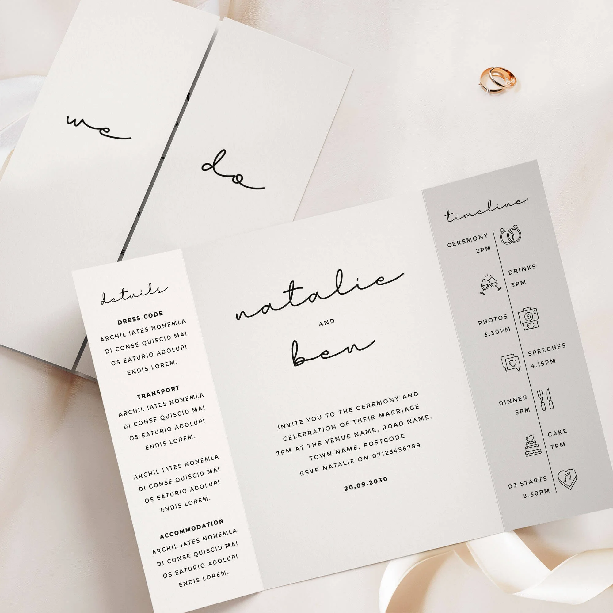
⭐️⭐️⭐️⭐️⭐️
Read what 1000s of happy couples say about us →
Timeless and refined, our Classic Collection gatefold invitation brings a formal elegance to your wedding stationery. Featuring a clean layout, traditional serif fonts, and minimalist detailing, it’s ideal for couples planning a formal, black-tie, or city wedding. The gatefold format offers generous space for your ceremony, reception, and timeline details – all presented in a beautifully balanced, understated style. Designed and handled personally by Harry & Ami – every order is managed with care until you’re fully happy.
What’s Included?
– Gatefold Wedding Invitations in your chosen design, printed on 300gsm off-white tactile paper.
– Plain white envelopes are included free of charge. Prefer colour envelopes? Browse colour envelope options.
– Full design service included. We create your design for you and send digital proofs, with revisions until you’re happy.
– Free standard UK delivery for a limited time.
How to Order
– Simply select the quantity of Gatefold Wedding Invitations you need and complete your purchase. You’re in safe hands.
– Once your order is placed, we’ll personally email you within 1 business day to request your wording (we’ll also include a helpful example of how to send it).
– We’ll take care of the full design for you and send a digital proof (PDF) within one business day. Need any changes? No problem at all – we’re happy to tweak it until you’re completely happy. Nothing is printed until you give us the final go-ahead.
– It’s just the two of us here – myself (Harry) and my wife (Ami) – and we personally handle every order with care. We’re here to make it easy and stress-free for you.
Please note: If you need separate Day and Evening Wedding Invitations (with different wording), please add them to your basket as separate items. For example, add 20 Day and 30 Evening cards individually, rather than one combined quantity of 50.
What Can I Customise?
– Want to change the wording on the front of the gatefold (e.g., “We Do”)? No problem! You can personalise it with your names, initials, or other wording you’d prefer.
– Prefer extra wording instead of the timeline section? We can swap it out for wording more meaningful to you.
– The text on the details panel is completely customisable – feel free to change it to suit your needs and all the wording on the middle panel can be tailored to better reflect your information.
– Choose from over 50 different wedding related icons to fully personalise your Order of the Day Timeline.
– Need more space for wording? We offer text-only printing on the back at no extra cost.
– QR codes can be added (please note: we can’t change the colour of the QR code and can only use the file you provide).
– Colour changes may be possible on some designs. Generally, text-only designs can be colour-edited, while illustrated ones cannot, but feel free to message us to check.
Guest Name Printing
Normally, your invitation might read something like "Sarah and James invite you to the ceremony and celebration of their marriage", but with guest name printing, we replace that with your guest's actual name, so it reads "Sarah and James invite Emily and Tom to the ceremony and celebration of their marriage" instead — personalised for exactly who's being invited. If more than one person is invited on the same card (a couple, a family, or a group of friends) we can include all of their names together, and this still counts as just one guest name for pricing, however many you list — we'll always make sure everything fits neatly on a single line, so it looks beautiful every time.
Want some invitations with names and some without? For example, if you've ordered 50 invitations but only have 45 names ready, simply select guest name printing from the dropdown as normal — we'll use your full list, and any spares will be left with a gap for you to handwrite a name yourself. Handy for any last-minute additions to your guest list.
Add Matching RSVP Cards
An RSVP card is how your guests let you know whether they can attend (“RSVP" simply means "please reply.”) Your guests fill in the card to confirm they're coming (and often note things like dietary requirements), then post it back to you using the free envelope provided, so you know your final numbers in good time for your venue and caterer.
Complete your suite with RSVP cards printed in the same design as your invitations, so your whole first impression feels considered and coordinated. Each is an A7 card supplied with a free envelope, ready for your guests to reply by post.
Dimensions
– A6 size (105mm x 148mm) once folded, A5 size when flat (148mm x 210mm).
– Prefer a larger size? You can also order this design in A5 (once folded), click here for pricing and details.
Paper Type & Sustainability
Your Gatefold Wedding Invitations are digitally printed on 300gsm luxury off-white, tactile paper. Each order includes plain white envelopes free of charge.
Please note: any silver or gold elements are printed digitally (not foil).
Wedding Invitation paper details:
– Elemental Chlorine Free
– FSC® Mix Certified
– Acid Free
– Free from Heavy Metals
– Long Life
– Contains Selected Secondary Fibres
Are Samples Available?
Yes, we offer non-personalised samples for many of our designs. Browse our wedding stationery samples to see the quality before you order.
Matching Stationery
View the full Classic Collection for matching wedding stationery in this design, or browse all Gatefold Wedding Invitations to explore more styles.
Turnaround Times
– Once we receive your order, we’ll message you for your wording. After we have it, you’ll receive a digital proof within 1 business day (often same day, depending on timing).
– If your order includes a bespoke venue illustration, please allow up to 2 additional days for your proof.
– Need changes? Each round of amends takes 1 business day. On average, allow around a week for the full design process, depending on how quickly we receive your feedback.
– Once you approve your design, printing usually takes 1–2 business days, and delivery 1–3 business days. We recommend allowing up to 2 weeks total to cover any unexpected courier delays.
– Need it sooner? We offer faster tracked delivery, please get in touch for pricing and availability.
Important Details
– If you have any concerns at all, please don’t hesitate to reach out – we genuinely want you to love your stationery. In the rare event of courier damage or a lost parcel, we’ll always ensure your items are reprinted and resent, so you can feel confident you’ll receive exactly what you’ve paid for.
– Full refunds cannot be offered once a digital file or physical item has been sent, as every item is personalised.
– Colours may appear different in print than on screen because printing and digital displays use different colour processes and values.
– Colours may vary between samples, orders, and batches – similar to wallpaper printing, which requires single-batch orders for consistency.
– All images, designs, and product descriptions on our website are protected by copyright. They may not be edited, copied, recreated, or used for personal or commercial purposes without permission. This includes reproducing wording or designs.
– Sharing our products on social media is allowed only if you tag us clearly. We monitor for infringement closely. Unauthorised copying or use of our designs or descriptions will be met with legal action. H&A.
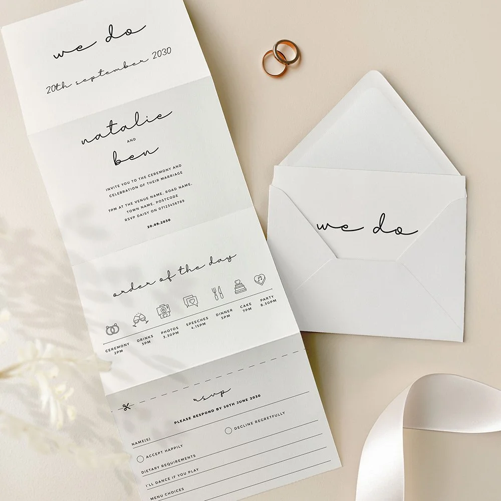
⭐️⭐️⭐️⭐️⭐️
Read what 1000s of happy couples say about us →
The Classic Collection concertina wedding invitation features a sleek black and white colour palette with contemporary typography throughout. Designed for modern couples seeking a refined and timeless aesthetic, this minimalist layout keeps all your wedding details neatly presented, complete with a built-in tear-off RSVP card for effortless guest replies. Understated yet elegant, it’s a perfect match for city weddings, black tie celebrations, or stylish venues. Designed and handled personally by Harry & Ami – every order is managed with care until you’re fully happy.
What’s Included?
– Concertina Wedding Invitations in your chosen design, printed on 300gsm off-white tactile paper. Each invitation includes a tear-off RSVP card as part of the design. If you'd prefer guests to RSVP via QR code or email, we can replace the tear-off panel with a text-only version instead.
– C6 plain white envelopes are included free of charge. Prefer colour envelopes? Browse colour envelope options.
– Full design service included. We create your design for you and send digital proofs, with revisions until you’re happy.
– Free standard UK delivery for a limited time.
How to Order
– Simply select the quantity of Concertina Wedding Invitations you need and complete your purchase. You’re in safe hands.
– Once your order is placed, we’ll personally email you within 1 business day to request your wording (we’ll also include a helpful example of how to send it).
– We’ll take care of the full design for you and send a digital proof (PDF) within one business day. Need any changes? No problem at all – we’re happy to tweak it until you’re completely happy. Nothing is printed until you give us the final go-ahead.
– It’s just the two of us here – myself (Harry) and my wife (Ami) – and we personally handle every order with care. We’re here to make it easy and stress-free for you.
Please note: If you need separate Day and Evening Wedding Invitations (with different wording), please add them to your basket as separate items. For example, add 20 Day and 30 Evening cards individually, rather than one combined quantity of 50.
What Can I Customise?
– If you’d prefer more space for wording, we can swap the timeline panel for additional text, or even replace the RSVP panel if it’s not needed.
– If you’ve selected double-sided printing, the details panel wording is fully customisable – use any text you prefer.
– Choose from over 50 different wedding related icons to fully personalise your Order of the Day Timeline.
– All text on the main invitation panel is editable to perfectly match your wedding wording preferences.
– QR codes can be added (please note: we can’t change the colour of the QR code and can only use the file you provide).
– Colour changes may be possible on some designs. Generally, text-only designs can be colour-edited, while illustrated ones cannot, but feel free to message us to check.
Guest Name Printing
Normally, your invitation might read something like "Sarah and James invite you to the ceremony and celebration of their marriage", but with guest name printing, we replace that with your guest's actual name, so it reads "Sarah and James invite Emily and Tom to the ceremony and celebration of their marriage" instead — personalised for exactly who's being invited. If more than one person is invited on the same card (a couple, a family, or a group of friends) we can include all of their names together, and this still counts as just one guest name for pricing, however many you list — we'll always make sure everything fits neatly on a single line, so it looks beautiful every time.
Want some invitations with names and some without? For example, if you've ordered 50 invitations but only have 45 names ready, simply select guest name printing from the dropdown as normal — we'll use your full list, and any spares will be left with a gap for you to handwrite a name yourself. Handy for any last-minute additions to your guest list.
Dimensions
– A6 once folded (105mm x 148mm), 420mm x 148mm when flat.
What are the 8 panels if I select double sided?
1. Cover panel – Typically features your names or initials.
2. Invitation panel – Includes the venue name, date, time, and other key details.
3. Timeline panel – Showcases your order of the day with icons (choose from 50 available).
4. RSVP panel – For guest responses.
5. Details panel 1 – Ideal for your gift wish, wedding website, or a QR code.
6. Details panel 2 – Can include dress code, travel directions, or accommodation info.
7. Details panel 3 – Often used for a menu or dietary notes.
8. Reverse of the RSVP panel – Typically features your return address.
Prefer fewer panels or want to customise? No problem! We can leave panels blank or swap them – for example, replacing the timeline with extra wording or other content.
What are the 4 panels if I select single sided?
1. Cover panel – Typically features your names or initials.
2. Invitation panel – Includes your venue name, date, time, and key details.
3. Timeline panel – Displays your order of the day using icons (we have 50 to choose from). This can be swapped for a details panel if preferred.
4. RSVP panel – Adapted into a single-sided postcard format for the single-sided option.
Want to make changes? We can leave panels blank or customise the layout—such as removing the timeline to include additional wording or other information.
RSVP Panel
Your guests can easily tear off the RSVP panel along the perforated edge, which will already have your return address printed. If you’ve selected double-sided printing, the address will appear on the reverse; for single-sided, it will be printed on the front. The RSVP includes customisable sections for names, accept/decline options, dietary requirements, song choices, and more – tailored to suit your needs. If you would like a bespoke menu choice RSVP panel please get in touch for pricing.
Paper Type & Sustainability
Your Concertina Wedding Invitations are digitally printed on 300gsm luxury off-white, tactile paper. Each order includes plain white envelopes free of charge.
Please note: any silver or gold elements are printed digitally (not foil).
Wedding Invitation paper details:
– Elemental Chlorine Free
– FSC® Mix Certified
– Acid Free
– Free from Heavy Metals
– Long Life
– Contains Selected Secondary Fibres
Are Samples Available?
Yes, we offer non-personalised samples for many of our designs. Browse our wedding stationery samples to see the quality before you order.
Matching Stationery
View the full Classic Collection for matching wedding stationery in this design, or browse all Concertina Wedding Invitations to explore more styles.
Turnaround Times
– Once we receive your order, we’ll message you for your wording. After we have it, you’ll receive a digital proof within 1 business day (often same day, depending on timing).
– If your order includes a bespoke venue illustration, please allow up to 2 additional days for your proof.
– Need changes? Each round of amends takes 1 business day. On average, allow around a week for the full design process, depending on how quickly we receive your feedback.
– Once you approve your design, printing usually takes 1–2 business days, and delivery 1–3 business days. We recommend allowing up to 2 weeks total to cover any unexpected courier delays.
– Need it sooner? We offer faster tracked delivery, please get in touch for pricing and availability.
Important Details
– If you have any concerns at all, please don’t hesitate to reach out – we genuinely want you to love your stationery. In the rare event of courier damage or a lost parcel, we’ll always ensure your items are reprinted and resent, so you can feel confident you’ll receive exactly what you’ve paid for.
– Full refunds cannot be offered once a digital file or physical item has been sent, as every item is personalised.
– Colours may appear different in print than on screen because printing and digital displays use different colour processes and values.
– Colours may vary between samples, orders, and batches – similar to wallpaper printing, which requires single-batch orders for consistency.
– All images, designs, and product descriptions on our website are protected by copyright. They may not be edited, copied, recreated, or used for personal or commercial purposes without permission. This includes reproducing wording or designs.
– Sharing our products on social media is allowed only if you tag us clearly. We monitor for infringement closely. Unauthorised copying or use of our designs or descriptions will be met with legal action. H&A.

About Our Typography Wedding Invitations
Our typography wedding invitations put beautiful lettering centre stage — bold modern type, flowing calligraphy, elegant script and timeless monograms, with clean, refined layouts. Perfect for modern, formal and city weddings, most designs come as a full matching suite.
Still deciding on your wedding theme?
Love a style that isn't shown here? Click below to browse all our designs and find the perfect style for your day!
Typography Wedding Invitations – FAQs
-
Designs where lettering is the hero — bold type, calligraphy, script and monograms rather than illustration.
-
From clean modern type to flowing calligraphy, formal monograms and elegant script.
-
Modern, formal and city weddings, and any couple who loves a sleek, design-led look.
-
Yes — monograms are a key part of the range and a lovely way to personalise your suite.
-
Yes — recommended, as crisp lettering really shows the print quality.
-
Yes — every design is a full matching suite, which looks especially sharp in type-led styles.
-
Send invitations 8–12 weeks before the day; allow 4–6 weeks ahead for proofing and printing.